
Edgecomb Gray vs Pale Oak: Which Greige Is Right for You?
Edgecomb Gray vs Pale Oak: how Benjamin Moore's two favourite greiges compare in undertone, LRV and light, and which to choose for your rooms.
By Magda Callery, interior designer and florist

Edgecomb Gray and Pale Oak are two of Benjamin Moore's most popular light neutrals. Both are soft greiges, a mix of gray and beige, and both are loved because they feel warmer than gray and fresher than beige. They look very similar on a small chip, yet on the wall they behave quite differently.
In this guide I'll explain how Edgecomb Gray and Pale Oak compare side by side, their undertones and LRV, how they look in different light, which works best in each room and outside, what to pair them with, and how to choose between them.
The quick answer: Edgecomb Gray is a little darker and warmer, leaning beige. Pale Oak is lighter and slightly cooler, leaning gray, and in some light it shows a very faint pink or violet cast. Choose Edgecomb Gray for a warm, cosy greige; choose Pale Oak for a lighter, airier greige that reads almost like a deep off-white.
Edgecomb Gray vs Pale Oak Side by Side
| Edgecomb Gray | Pale Oak | |
|---|---|---|
| Code | HC-173 | OC-20 |
| LRV | 63.09 | 68.64 |
| Hex | #D9D3C4 | #DDD9CE |
| RGB | 217, 211, 196 | 221, 217, 206 |
| Undertone | Warm, beige | Warm gray, can show a faint pink-violet cast |
| Look on the wall | Soft, warm greige | Light, airy greige |
| Best for | North-facing rooms, cosy schemes, exteriors | Smaller or darker rooms, whole-house colour |
In Benjamin Moore's words, Edgecomb Gray is "a go-to neutral that can refresh a space, while providing a warm, welcoming feeling," while Pale Oak has "warm gray undertones" and "conjures the quiet majesty of white oak." If you'd like to know more about the first, there's a full profile of Edgecomb Gray, with room ideas and coordinating colours.
The Difference in Undertones
- Edgecomb Gray has more beige in it. That makes it feel warm and welcoming, and it rarely looks cold, even in north light.
- Pale Oak has more gray. It looks lighter and more neutral, and in some rooms, especially with cool daylight or next to pink or purple tones, a faint pink or violet cast can appear.
A designer's tip: if your floors, worktops or sofa are warm wood or cream, Edgecomb Gray usually looks more harmonious. If your home has cool marble, gray stone or crisp white trim, Pale Oak often blends better.
LRV: Which Is Lighter?
Pale Oak's LRV of 68.64 is about five and a half points higher than Edgecomb Gray's 63.09. That's a noticeable difference: Pale Oak looks lighter on the wall and reflects more light, which is helpful in small or darker rooms. Edgecomb Gray has slightly more depth, which gives it a cosier feel and makes white trim stand out a little more.
How They Look in Different Light
| Room orientation | Edgecomb Gray | Pale Oak |
|---|---|---|
| North-facing | Stays warm; the safer choice | Can look grayer, sometimes faintly lilac |
| South-facing | Can look quite beige in strong sun | Light and balanced |
| East-facing | Warm and soft in the morning | Fresh and light in the morning |
| West-facing | Golden in the evening | Soft and warm in the evening |
| Warm bulbs | Cosy and beige | Soft greige |
Edgecomb Gray vs Pale Oak Room by Room
Living rooms
Both make lovely living room colours. Edgecomb Gray feels cosier, especially with warm wood, leather and wool. Pale Oak feels lighter and more contemporary, especially with linen, marble and black accents.
Kitchens
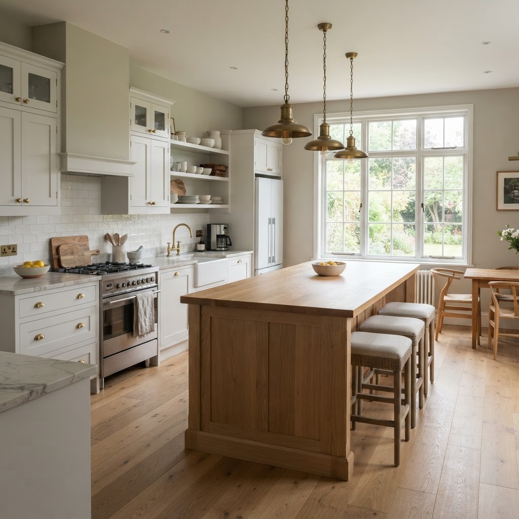
Pale Oak walls look fresh with white cabinets and stone worktops. Edgecomb Gray suits warm wood islands, brass and cream cabinets.
Bedrooms
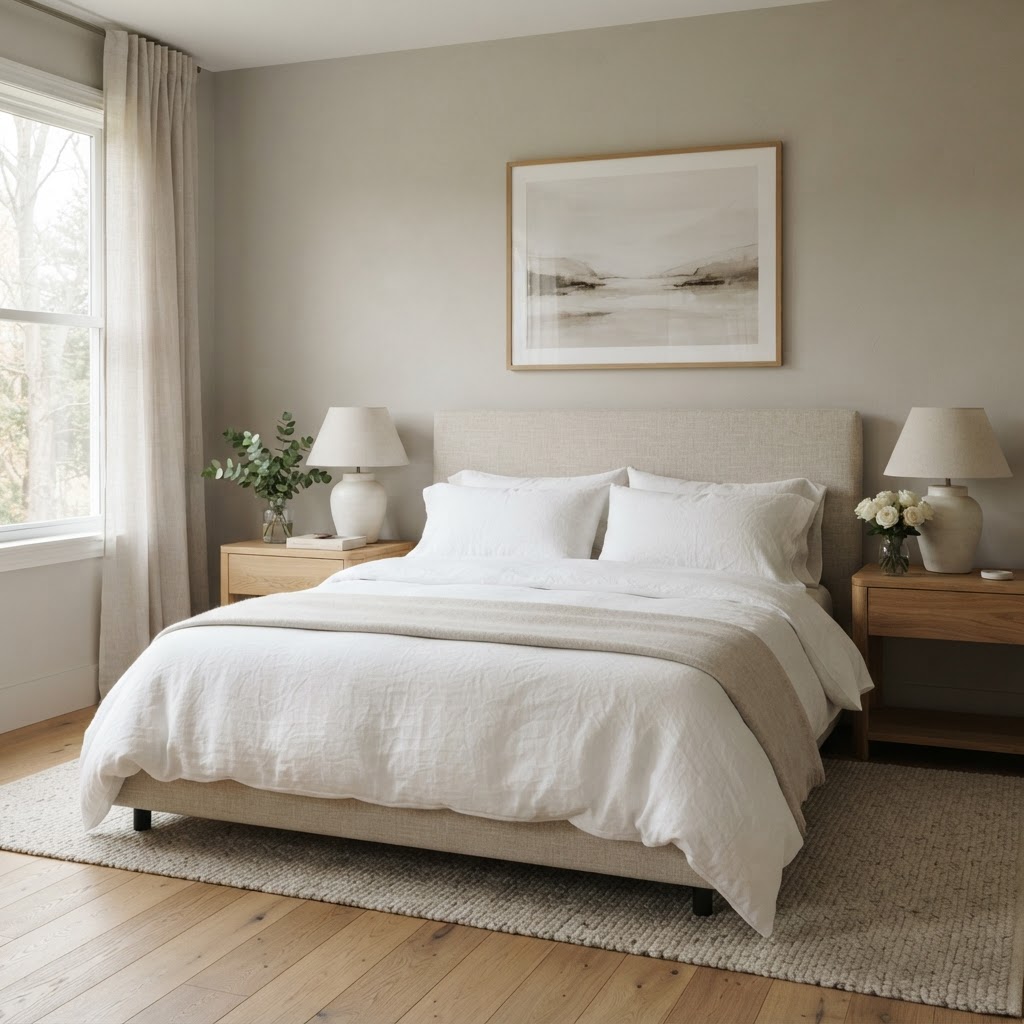
Both are calm and restful. Edgecomb Gray suits a cosy bedroom with warm textiles; Pale Oak suits a light, serene bedroom with white bedding and pale wood.
Dining rooms and hallways
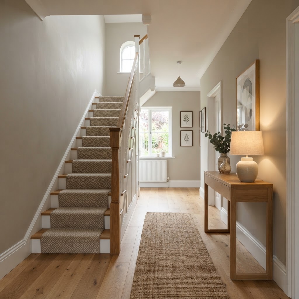
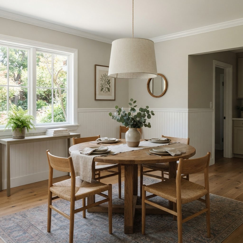
In a hallway with little natural light, Pale Oak's higher LRV helps. In a dining room used mostly in the evening, Edgecomb Gray glows warmly under lamps and candles.
Exteriors
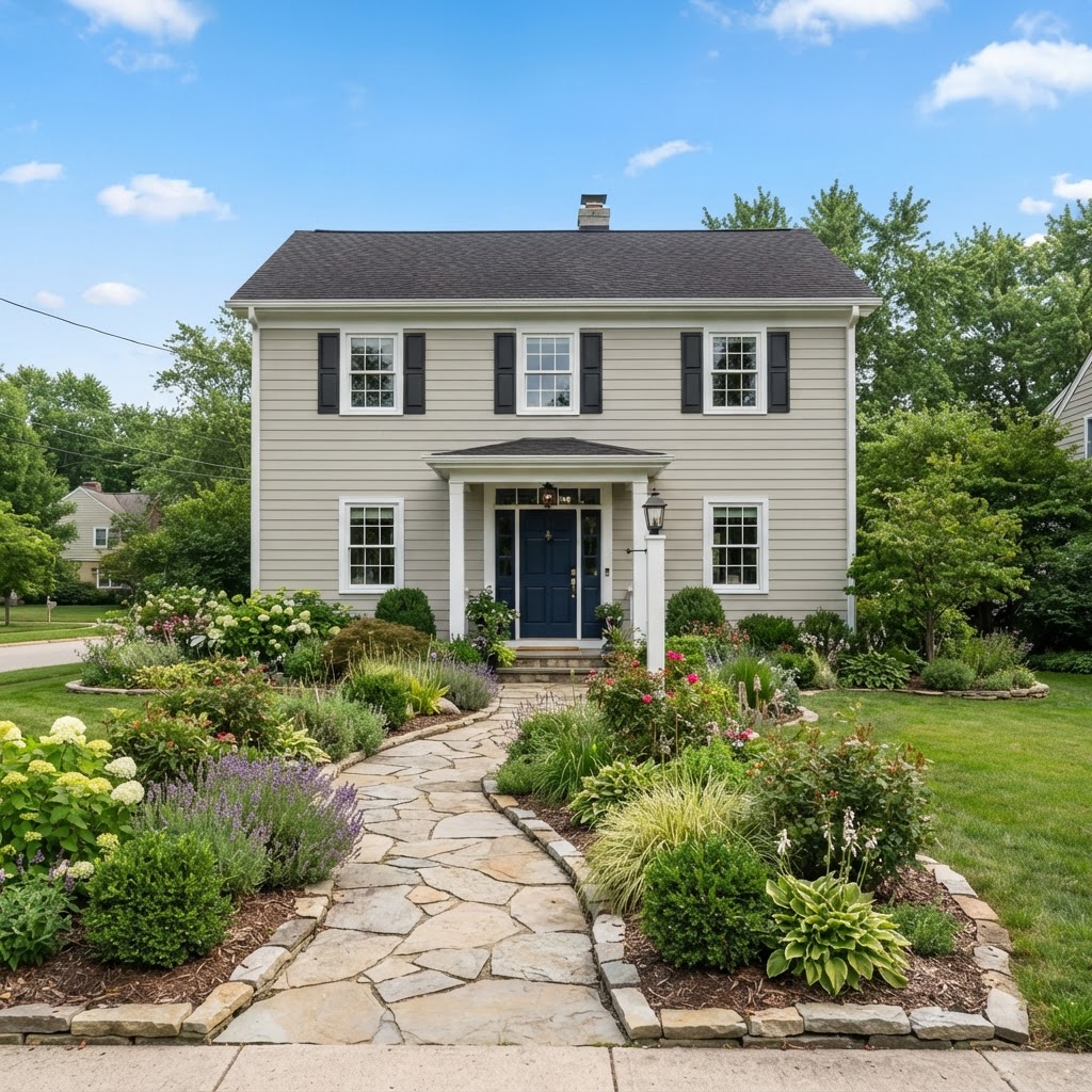
Both are popular exterior colours. Outdoors, they'll look lighter than inside, so Edgecomb Gray often reads as a warm, soft gray, and Pale Oak can look almost like an off-white. Edgecomb Gray is a classic choice for siding with white trim, as on a white house with gray trim in reverse.
Colors That Go With Edgecomb Gray and Pale Oak
| Colour | Code | LRV | How to use it |
|---|---|---|---|
| Chantilly Lace | OC-65 | 90.04 | Crisp trim and ceilings |
| White Dove | OC-17 | 83.16 | Softer trim for a gentle contrast |
| Stonington Gray | HC-170 | 59.36 | A cooler gray for adjoining rooms with Pale Oak |
| Revere Pewter | HC-172 | 55.05 | A deeper greige to step up from Edgecomb Gray |
| Hale Navy | HC-154 | 8.36 | Doors, islands and accent walls |
| Wrought Iron | 2124-10 | 8.17 | Windows, doors and exterior accents |
Benjamin Moore suggests Chantilly Lace and Wrought Iron among the coordinating colours for Pale Oak. Both greiges also look beautiful with sage green, warm wood, brass and natural linen. If you're choosing a trim white, Simply White and White Dove are two of the most popular.
Similar Colours to Compare
| Colour | LRV | Compared with Edgecomb Gray and Pale Oak |
|---|---|---|
| Benjamin Moore Balboa Mist 1549 | 65.53 | Sits between them; a pale gray with a slightly warm cast |
| Sherwin-Williams Agreeable Gray SW 7029 | 60.4 | Similar in depth to Edgecomb Gray, slightly grayer |
| Sherwin-Williams Drift of Mist SW 9166 | 69.1 | Similar in lightness to Pale Oak |
| Benjamin Moore Revere Pewter HC-172 | 55.05 | Darker and deeper |
Benjamin Moore lists Balboa Mist as a similar colour to Pale Oak, and it's often suggested as the closest Benjamin Moore alternative to Sherwin-Williams Drift of Mist.
How to Test Them
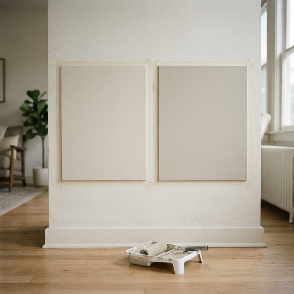
- Paint large samples of both on several walls, including the darkest wall in the room.
- Look at them in the morning, afternoon and evening, and under your lamps.
- Compare them next to your floor, worktops, sofa and trim colour.
- If you see a pink or lilac cast in Pale Oak that you don't like, Edgecomb Gray or Balboa Mist may suit you better.
Frequently Asked Questions
Is Pale Oak lighter than Edgecomb Gray?
Yes. Pale Oak has an LRV of 68.64, while Edgecomb Gray has an LRV of 63.09, so Pale Oak looks noticeably lighter.
Is Edgecomb Gray warmer than Pale Oak?
Yes. Edgecomb Gray leans more beige and warm, while Pale Oak leans more gray.
Does Pale Oak look pink?
In some light, particularly cool north light or next to pink and purple tones, Pale Oak can show a faint pink or violet cast. In most rooms it reads as a light, soft greige.
Is Edgecomb Gray a gray or a beige?
It's a greige: a warm mix of gray and beige. In most light it reads as a soft, warm neutral rather than a true gray.
Which is better for a north-facing room?
Edgecomb Gray, because its beige warmth balances cool north light.
Which is better for a small or dark room?
Pale Oak, because its higher LRV reflects more light.
What white trim goes with Edgecomb Gray and Pale Oak?
Chantilly Lace gives a crisp contrast, and White Dove gives a softer one. Both work with either greige.
Which Should You Choose?
Choose Edgecomb Gray if you want a warm, cosy greige, your room faces north, or your home has lots of warm wood and cream. Choose Pale Oak if you want a lighter, airier greige, your room is small or dark, or your home has cool stone and crisp whites.
And if you'd like help choosing the right neutral for your home, you can book a one-hour online interior design consultation with me.
About the author
Magda Callery is a UK interior designer and florist with more than 15 years' experience designing homes, pubs, restaurants and bars, and her expert commentary has featured in Homes & Gardens, The Mirror and The Spruce. Explore more of the decorating articles.
Continue reading

White Brick House: 19 Ideas, Paints and What to Know
19 white brick house ideas, plus paint vs limewash vs German smear, the best white paints for brick and the trim colours that suit white brick.


Green House Colors: 17 Exterior Ideas and Paint Colors
17 green house colour ideas, from sage farmhouses to forest green Victorians, plus the best green exterior paints and trim, door and roof colours.


What Does Red and Blue Make? Mixing Paint, Light and Purple
What do red and blue make? Purple in paint and magenta in light. Why your purple turns brown, how to mix every shade, and how to use purple at home.