
Sherwin-Williams Dorian Gray: Undertones, LRV and Pairings
Sherwin-Williams Dorian Gray reviewed: what it looks like, its undertones and LRV, the best rooms for it, colours that go with it and similar shades.
By Magda Callery, interior designer and florist
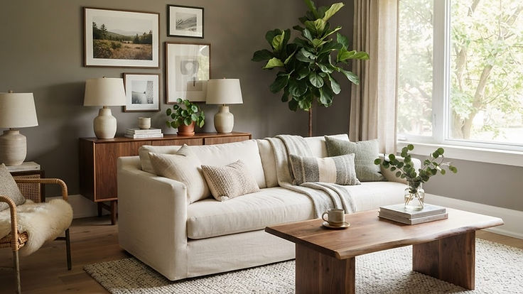
Sherwin-Williams Dorian Gray is a mid-tone warm gray that sits in the sweet spot between light greige and deep charcoal. It's deep enough to give walls, cabinets and exteriors real presence, but soft and warm enough to feel welcoming rather than cold. If you've found lighter grays too washed out and darker ones too heavy, Dorian Gray may be the answer.
In this guide I'll explain what Dorian Gray looks like, its undertones and LRV, how it changes in different light, where it works best, the colours that go with it, similar colours to compare, and the mistakes to avoid.
Dorian Gray at a Glance
| Sherwin-Williams Dorian Gray | |
|---|---|
| Code | SW 7017 |
| LRV | 38.7 |
| Hex | #ACA79E |
| RGB | 172, 167, 158 |
| Colour family | Neutral |
| Undertone | Warm gray, with a subtle green-beige cast |
| Depth | Mid-tone |
These values come from Sherwin-Williams' own page for Dorian Gray. An LRV of 38.7 places it firmly in the middle of the scale, where 0 is black and 100 is pure white. It reflects less than half the light that hits it, so it reads as a true mid-tone rather than a light neutral.
What Does Dorian Gray Look Like?
Dorian Gray is a warm gray with a little beige in it, so many designers would call it a greige. It doesn't look blue or icy, and it doesn't look brown or muddy either. In most rooms it reads as a soft, grounded, stony gray.
- In bright, south-facing rooms it looks warm, soft and balanced.
- In north-facing rooms it looks deeper and cooler, and its subtle green cast may become more noticeable.
- Under warm bulbs it looks cosy and slightly more beige.
- Outdoors it looks lighter than inside, like a soft stone gray.
A designer's tip: because Dorian Gray is a mid-tone, it needs light. In a small, dark room, it can look heavy, so consider a lighter shade from the same family, or use it on cabinets and woodwork rather than all four walls.
The Dorian Gray Family
Dorian Gray sits in a family of warm Sherwin-Williams grays that are easy to use together:
| Colour | Code | LRV | Hex | Compared with Dorian Gray |
|---|---|---|---|---|
| Agreeable Gray | SW 7029 | 60.4 | #D1CBC1 | Much lighter; a popular whole-house greige |
| Mindful Gray | SW 7016 | 47.7 | #BCB7AD | A step lighter |
| Dorian Gray | SW 7017 | 38.7 | #ACA79E | |
| Gauntlet Gray | SW 7019 | 17.4 | #78736E | Much deeper; a warm charcoal |
| Iron Ore | SW 7069 | 5.55 | #434341 | A soft black |
Using colours from the same family is an easy way to create a calm, connected scheme. You could use Mindful Gray on walls, Dorian Gray on cabinets and Gauntlet Gray on an island or front door.
Where to Use Dorian Gray
Living rooms
In a bright living room, Dorian Gray walls feel warm and enveloping without being dark. Pair them with white trim, cream upholstery, walnut and plenty of green plants.
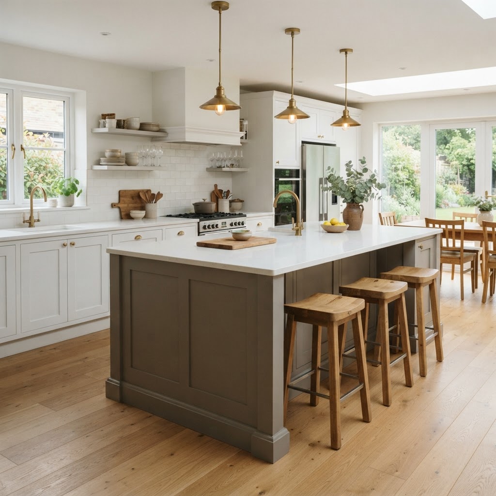
Kitchens
Dorian Gray is a lovely kitchen island colour with white cabinets, or a soft, warm cabinet colour all round. It looks beautiful with brass, white quartz or marble, and oak.
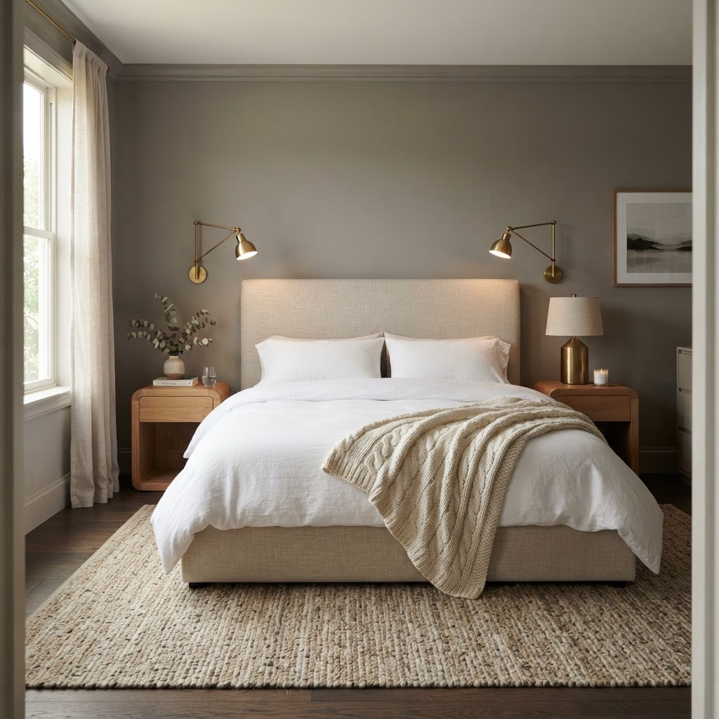
Bedrooms
Dorian Gray creates a calm, grounded bedroom, especially with white bedding, wool throws and warm wood.
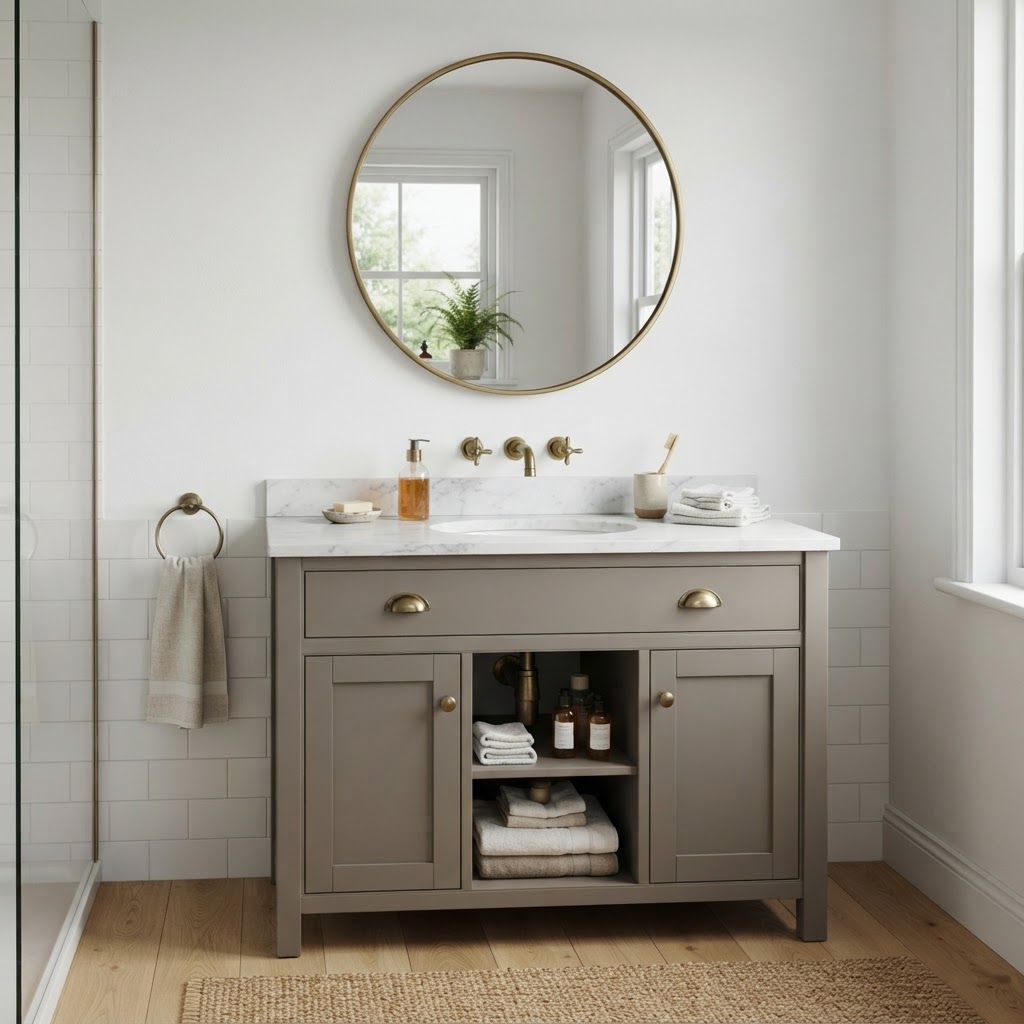
Bathrooms
A Dorian Gray vanity with a marble top and brass taps looks smart and timeless against white walls.
Dining rooms and home offices
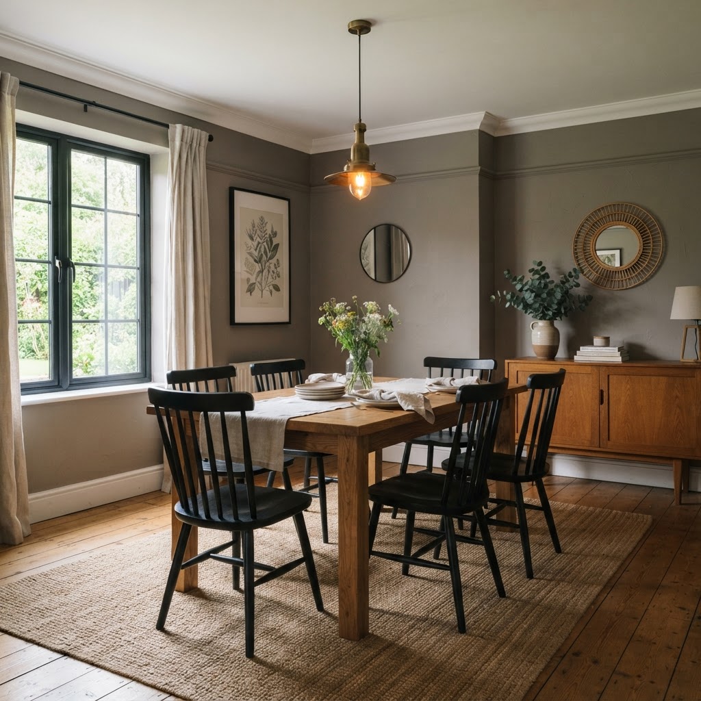
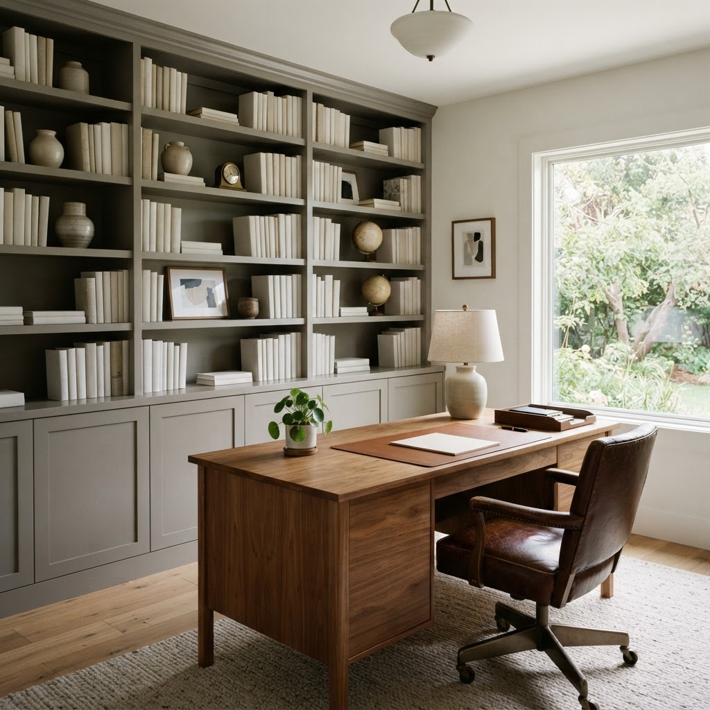
Dorian Gray suits rooms used in the evening, where its depth feels warm and intimate under lamps. It also makes a handsome colour for built-in shelving and cabinetry in a study, especially with walnut and leather.
Exteriors
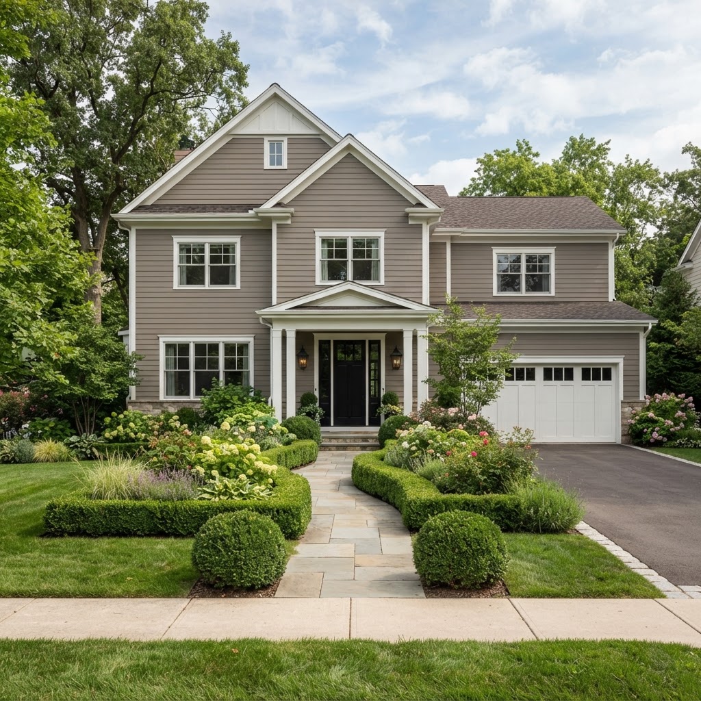
Outside, Dorian Gray reads as a soft, warm stone gray. It's a popular siding colour with crisp white trim and a black door, and it suits colonials, cottages and farmhouses. If you like the look of gray and white, a white house with gray trim is the reverse version of the same idea.
Colors That Go With Dorian Gray
| Colour | Code | LRV | How to use it |
|---|---|---|---|
| Pure White | SW 7005 | 84.0 | Crisp trim and ceilings |
| Alabaster | SW 7008 | 82.2 | Softer, warmer trim |
| Agreeable Gray | SW 7029 | 60.4 | Lighter walls in adjoining rooms |
| Gauntlet Gray | SW 7019 | 17.4 | Doors, islands and accents |
| Iron Ore | SW 7069 | 5.55 | Windows, doors and exterior trim |
Natural oak, walnut, brass, black metal, sage green, navy and rust all pair well with Dorian Gray. If you're choosing a trim white, Greek Villa and Alabaster are two of the warmest options.
Similar Colors to Compare
| Colour | LRV | Compared with Dorian Gray |
|---|---|---|
| Sherwin-Williams Mindful Gray SW 7016 | 47.7 | Lighter, same family |
| Benjamin Moore Revere Pewter HC-172 | 55.05 | Noticeably lighter and warmer |
| Benjamin Moore Kendall Charcoal HC-166 | 14.61 | Much darker |
| Benjamin Moore Museum Piece CSP-40 | 41.47 | Often suggested as a close Benjamin Moore alternative; a fraction lighter |
For a much darker gray, graphite gives a deep, dramatic look, and for something lighter, Sherwin-Williams Drift of Mist is a soft, pale neutral.
Mistakes to Avoid
| Mistake | Why it's a problem | What to do instead |
|---|---|---|
| Using it in a small, dark room | Looks heavy and dull | Choose Mindful Gray or Agreeable Gray |
| Pairing it with cool blue-whites | Makes it look muddy | Use warm whites such as Alabaster or Pure White |
| Testing a tiny chip | Mid-tones look very different on a whole wall | Paint large sample boards |
| Cool daylight bulbs | Make it look flat and cold | Use warm bulbs |
Frequently Asked Questions
Is Dorian Gray warm or cool?
Dorian Gray is a warm gray, with a subtle beige and green cast. It can look slightly cooler in north light.
What is the LRV of Dorian Gray?
Dorian Gray has an LRV of 38.7, which makes it a mid-tone color.
Is Dorian Gray too dark?
It can be in a small or poorly lit room. In rooms with good natural light, it looks warm and grounded rather than dark.
What white goes with Dorian Gray?
Warm whites such as Alabaster and Pure White work best. Very cool, blue-white trim can make Dorian Gray look muddy.
Is Dorian Gray good for kitchen cabinets?
Yes. It's a popular cabinet and island colour, especially with brass hardware and white worktops.
Is Dorian Gray a greige?
Yes. It's a warm gray with a little beige in it, so it's often described as a greige.
What is the Benjamin Moore equivalent of Dorian Gray?
There's no exact equivalent, but Museum Piece CSP-40 is often suggested as a close alternative.
Is Dorian Gray Right for You?
Choose Dorian Gray if you want a warm, grounded gray with real depth, especially for cabinets, kitchen islands, bathroom vanities, exteriors and bright living rooms. Test it in your own light, pair it with warm whites, and use lighter or darker shades from the same family to build a calm, connected scheme.
And if you'd like help choosing grays and neutrals for your home, you can book a one-hour online interior design consultation with me.
About the author
Magda Callery is a UK interior designer and florist with more than 15 years' experience designing homes, pubs, restaurants and bars, and her expert commentary has featured in Homes & Gardens, The Mirror and The Spruce. Explore more of the decorating articles.
Continue reading

White Brick House: 19 Ideas, Paints and What to Know
19 white brick house ideas, plus paint vs limewash vs German smear, the best white paints for brick and the trim colours that suit white brick.


Green House Colors: 17 Exterior Ideas and Paint Colors
17 green house colour ideas, from sage farmhouses to forest green Victorians, plus the best green exterior paints and trim, door and roof colours.


What Does Red and Blue Make? Mixing Paint, Light and Purple
What do red and blue make? Purple in paint and magenta in light. Why your purple turns brown, how to mix every shade, and how to use purple at home.