
Graphite Color: What It Is and Colors That Go With It
What colour is graphite? Where the name comes from, graphite vs charcoal, the best graphite paint colours and what goes with graphite at home.
By Magda Callery, interior designer and florist
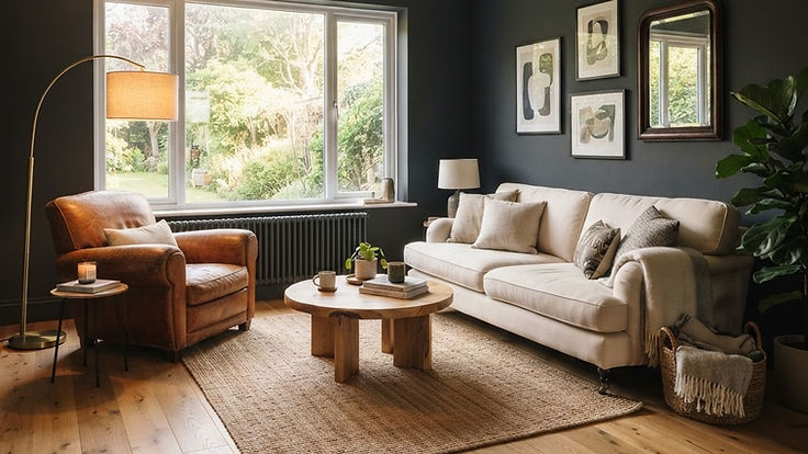
Graphite is one of the most sophisticated colours you can use at home. It's darker than slate, softer than black and has a quiet depth that makes walls, cabinets and exteriors look considered and calm. It's also one of the easiest dark colours to live with, because it works with almost every material and accent colour.
In this guide I'll explain what colour graphite is and where the name comes from, how graphite compares with charcoal, slate and gunmetal, its undertones, the best graphite paint colours, what colours go with graphite, and how to use it in living rooms, kitchens, bedrooms and on the outside of your house.
What Color Is Graphite?
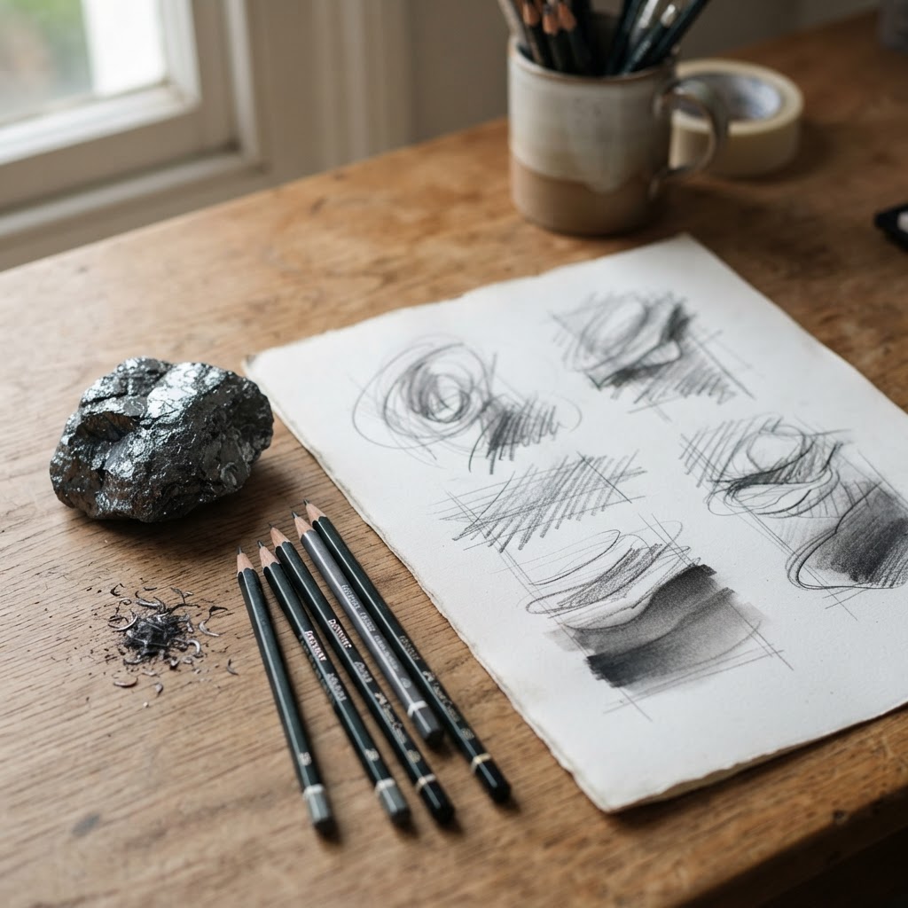
Graphite is a deep, dark gray, usually close to charcoal, with a slightly cool, almost metallic character. The colour takes its name from the mineral graphite, the soft form of carbon used in pencils. According to the US Geological Survey, graphite "is a soft, crystalline form of carbon" that "is gray to black, opaque, and has a metallic luster."
That's exactly the quality people love in graphite as a colour: it isn't flat black, but a soft, layered dark gray with a subtle sheen of depth. Think of the marks of a soft pencil on paper.
The name itself is linked to writing. Graphite comes from the Greek word graphein, "to write," and as the University of Minnesota's mineral guide points out, the "lead" in a modern pencil is actually graphite mixed with clay.
Is there a graphite hex code?
There's no single official graphite hex code. Graphite is a colour name rather than a standard, and every brand, fabric maker and colour library interprets it slightly differently. Most graphites sit somewhere between a mid charcoal and a soft black. For paint, the most reliable reference is a specific brand colour, such as Benjamin Moore Graphite 1603, which has a hex value of #444647.
Graphite vs Charcoal, Slate, Gunmetal and Black
| Colour | What it looks like | Compared with graphite |
|---|---|---|
| Graphite | Deep gray with a cool, slightly metallic depth | |
| Charcoal | Deep gray, often slightly warmer and softer | Very similar; charcoal is usually a touch warmer |
| Slate | Mid to dark gray with a blue or green cast | Lighter and more colourful |
| Gunmetal | Dark gray with a blue, metallic cast | Bluer and colder |
| Anthracite | Very dark, almost black gray | Darker |
| Soft black | Black softened with gray or brown | Darker and denser |
Graphite Undertones
Like every gray, graphite has an undertone, and it makes a big difference on the wall.
| Undertone | Effect | Best with |
|---|---|---|
| Neutral | Balanced and timeless | Almost anything |
| Blue | Cool, crisp and modern | White, chrome, pale wood, blue |
| Green | Earthy and calm | Oak, brass, sage, terracotta |
| Brown | Warm and cosy | Cream, leather, walnut, rust |
A designer's tip: in a north-facing room, choose a graphite with a warmer, brown or green undertone. Cool, blue graphites can look cold and heavy in cool light.
Best Graphite Paint Colors
| Paint | LRV | Hex | Character |
|---|---|---|---|
| Benjamin Moore Graphite 1603 | 7.59 | #444647 | "A deep gray hue, this elegant shade adds depth and drama to any space" |
| Sherwin-Williams Peppercorn SW 7674 | 9.7 | #585858 | A balanced, neutral dark gray |
| Benjamin Moore Kendall Charcoal HC-166 | 14.61 | #676662 | "A classic charcoal gray with timeless dependability and enduring appeal" |
| Benjamin Moore Wrought Iron 2124-10 | 8.17 | #494A4B | A soft, deep near-black |
| Sherwin-Williams Iron Ore SW 7069 | 5.55 | #434341 | A soft, warm off-black |
| Sherwin-Williams Gauntlet Gray SW 7019 | 17.4 | #78736E | A lighter, warm charcoal |
The Benjamin Moore descriptions and LRVs come from the brand's own colour pages. LRV runs from 0 for black to 100 for pure white, so every graphite reflects very little light. That's what gives graphite rooms their cocooning depth, but it also means you need good lighting.
Colors That Go With Graphite
| Colour | Effect |
|---|---|
| Warm white and cream | Crisp, timeless contrast |
| Mustard and ochre | Bold and cheerful |
| Blush pink | Soft and modern |
| Sage and olive green | Natural and calm |
| Terracotta and rust | Warm and earthy |
| Cognac and tan leather | Rich and cosy |
| Navy | Tonal and sophisticated |
| Brass and gold | Warm and luxurious |
| Natural oak and walnut | Warm and grounding |
How to Use Graphite at Home
Graphite living rooms
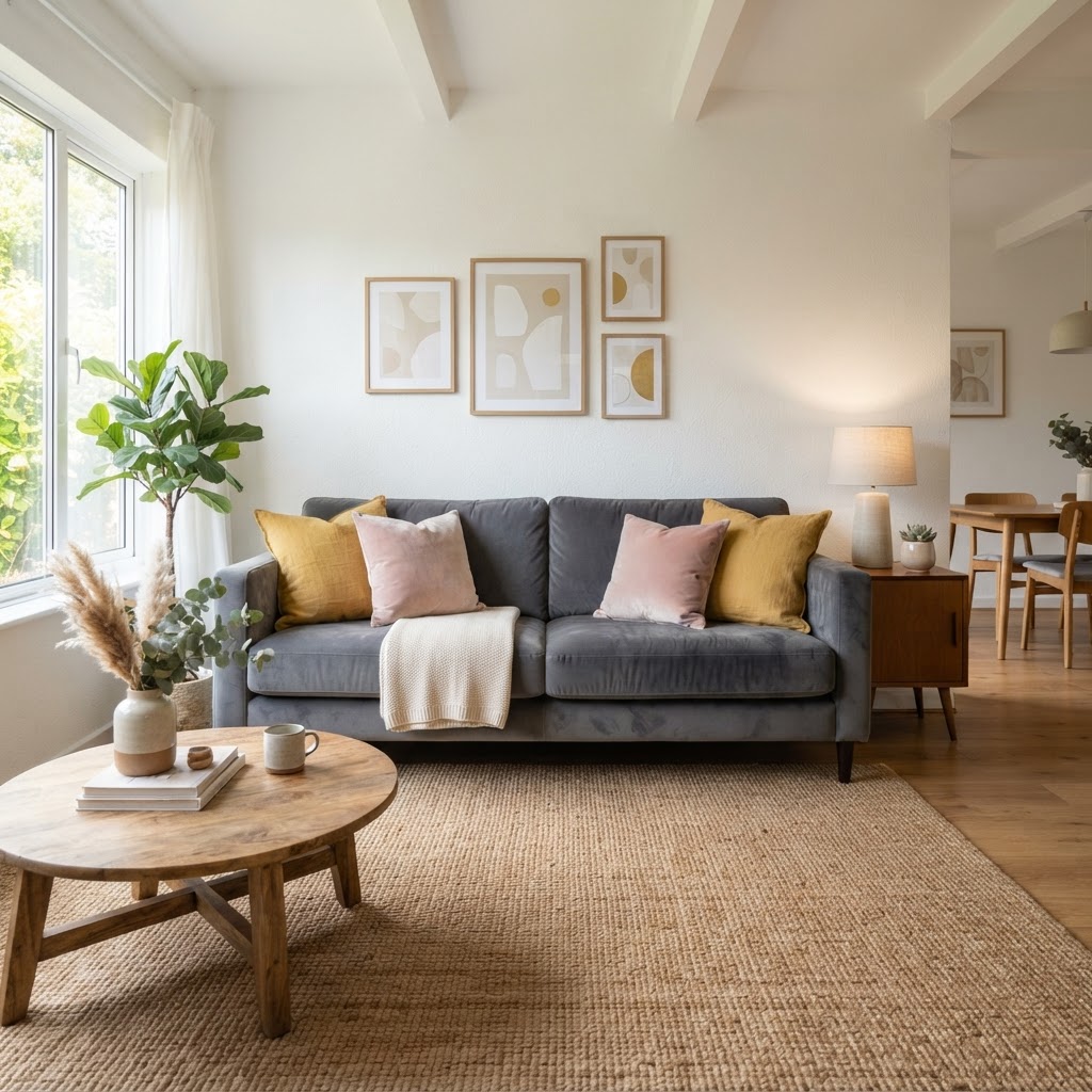
Graphite walls make a living room feel cosy and enveloping, especially in the evening. Balance them with a light sofa, a natural rug and warm leather or wood, and layer your lighting with floor lamps, table lamps and wall lights. A cognac leather chair looks wonderful against graphite, and the same warmth is behind many brown couch living room ideas.
Graphite kitchens
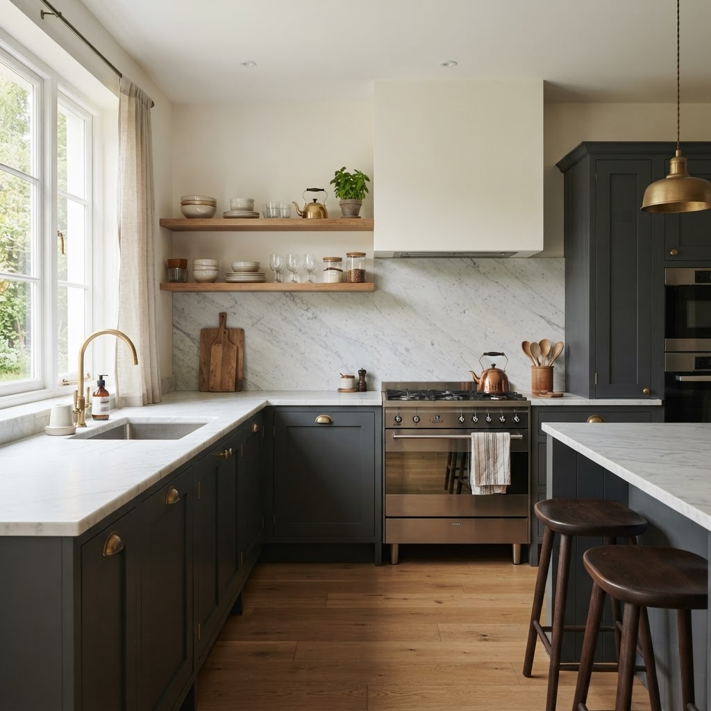
Graphite cabinets are a stylish alternative to navy or black. They look striking with white marble, brass handles and oak shelves, and they hide everyday marks well. For a sleek look, graphite slab doors suit a handleless kitchen.
Graphite bedrooms
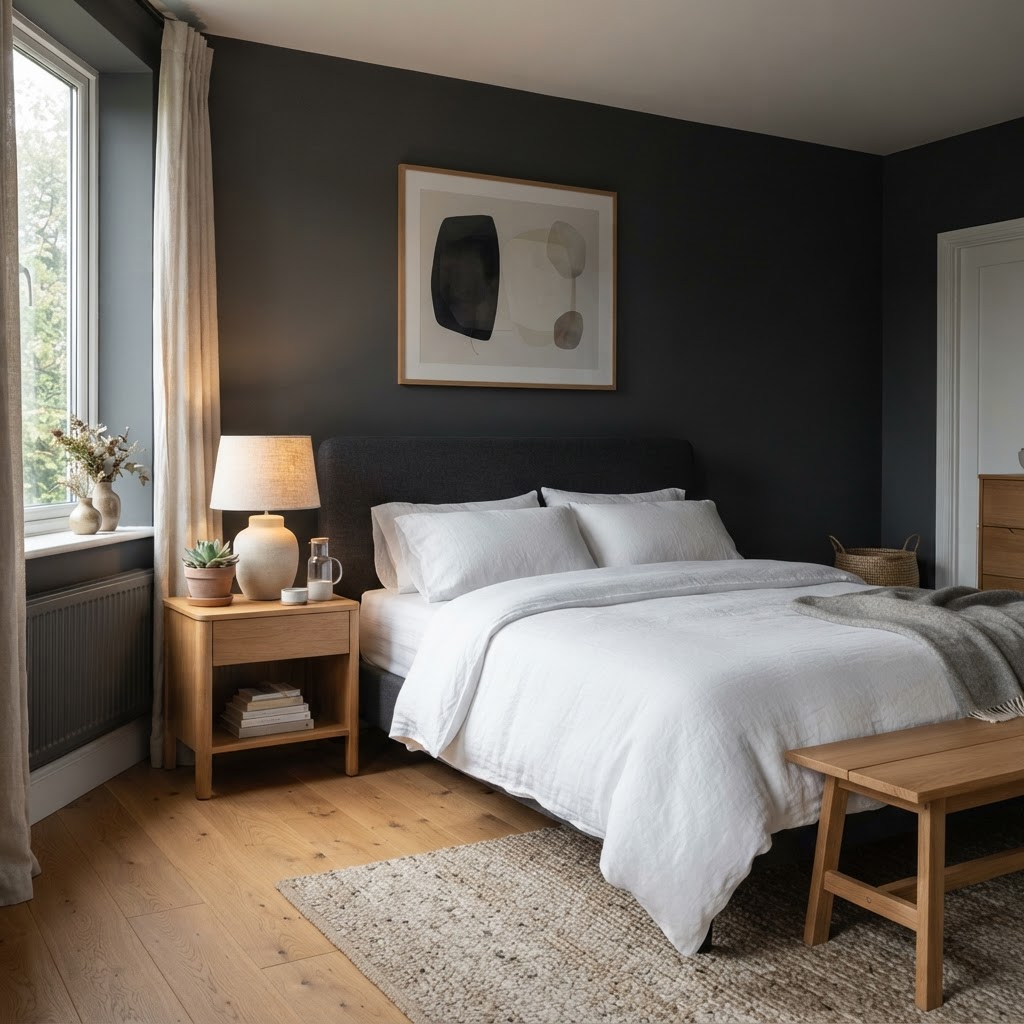
Dark walls can make a bedroom feel calm and restful, like a cocoon. Pair graphite with crisp white or soft linen bedding, oak furniture and warm bedside lamps.
Graphite home offices
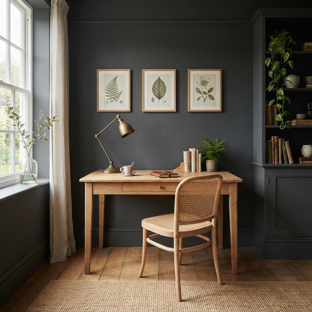
Graphite walls help a study feel focused and calm. A light oak desk, a cane chair and botanical prints keep the room from feeling heavy.
Graphite sofas and furniture
A graphite sofa is practical and smart. It's dark enough to hide wear but softer than black, and it works with almost every cushion colour, from mustard and blush to sage and rust.
Graphite exteriors
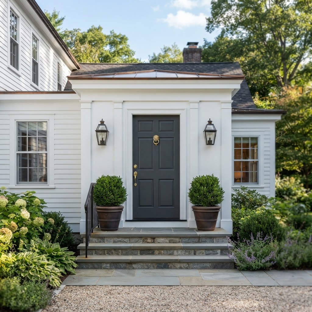
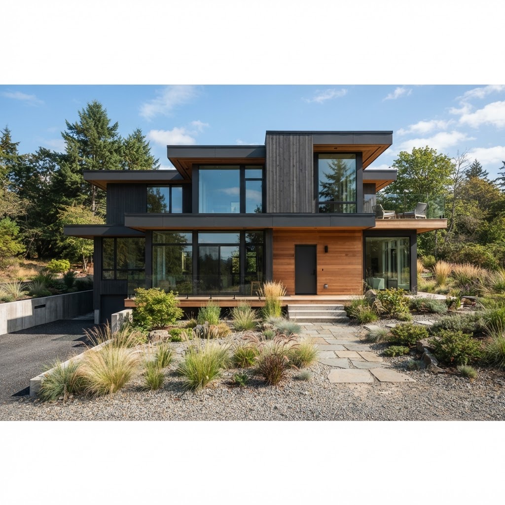
Graphite cladding, siding and windows look modern and architectural, especially with warm cedar or oak accents. It's similar in spirit to a black house with wood accents, but softer. Graphite window frames are also a gentler alternative to black on a house with black windows. A graphite front door is a simple way to try the colour outside.
Tips for Decorating With Graphite
- Test in your own light. Dark grays change dramatically between morning and evening.
- Use a matte or eggshell finish on walls for a soft, velvety look, and satin on woodwork.
- Paint the ceiling a lighter shade if you want to keep a graphite room from feeling too enclosed, or paint it graphite too for a dramatic, cocooning effect.
- Add texture. Linen, wool, velvet, leather and wood stop graphite from looking flat.
- Layer warm lighting. Warm bulbs make graphite feel cosy rather than cold.
Like other grays, graphite tends to feel calm, serious and grounding, which is why the psychology of gray makes it such a good choice for rooms meant for rest and focus.
Frequently Asked Questions
Is graphite gray or black?
Graphite is a very dark gray. It's lighter and softer than black, with a slightly metallic depth.
Is graphite the same as charcoal?
They're very similar. Charcoal is often a touch warmer and softer, while graphite can feel slightly cooler and more metallic.
What is the hex code for graphite?
There's no single official one. For paint, use a specific brand colour; Benjamin Moore Graphite 1603, for example, has a hex value of #444647.
Is graphite a warm or cool color?
Most graphites lean slightly cool, but you'll find warm graphites with brown or green undertones too.
What colors go with graphite?
Warm white, cream, mustard, blush pink, sage, terracotta, cognac leather, brass and natural wood all work beautifully with graphite.
Is graphite a good color for a small room?
It can be. Dark colours blur the corners of a room, which can make it feel cosier and even larger. Balance graphite walls with good lighting and lighter furniture.
Why is it called graphite?
It's named after the mineral graphite, the soft, dark form of carbon used in pencils. The mineral's name comes from the Greek word graphein, meaning "to write."
Deep, Soft and Timeless
Graphite is a dark colour that feels sophisticated rather than heavy. Choose a graphite with the right undertone for your light, balance it with warm materials and lighting, and it will look elegant for years.
If you're looking for a lighter gray, Sherwin-Williams Dorian Gray is a soft mid-tone option, and if you'd like help planning a scheme around a dark colour, you can book a one-hour online interior design consultation with me.
About the author
Magda Callery is a UK interior designer and florist with more than 15 years' experience designing homes, pubs, restaurants and bars, and her expert commentary has featured in Homes & Gardens, The Mirror and The Spruce. Explore more of the decorating articles.
Continue reading

White Brick House: 19 Ideas, Paints and What to Know
19 white brick house ideas, plus paint vs limewash vs German smear, the best white paints for brick and the trim colours that suit white brick.


Green House Colors: 17 Exterior Ideas and Paint Colors
17 green house colour ideas, from sage farmhouses to forest green Victorians, plus the best green exterior paints and trim, door and roof colours.

What Does Red and Blue Make? Mixing Paint, Light and Purple
What do red and blue make? Purple in paint and magenta in light. Why your purple turns brown, how to mix every shade, and how to use purple at home.