
Shutter Colors for a Beige House: 13 Expert Picks
The best shutter colors for a beige house, with advice from an interior designer and a home improvement specialist: undertones, 13 picks, roof and brick, colours and finishes to avoid.
By Magda Callery, interior designer and florist

Shutters are one of the quickest ways to change the look of a beige house. Beige, tan and sand walls are calm and timeless, but on their own they can look a little plain from the street. The right shutter colour frames the windows, adds depth and gives the whole facade a sense of purpose. The wrong one can make the house look muddy, dated or oddly split in two.
In this guide I'll share 13 of the best shutter colors for a beige house, with advice from two experts: an interior designer in Dubai and a kitchen and home improvement specialist with 20 years of remodelling experience in California. You'll also find how to read your beige's undertone, whether shutters should match the front door, how the roof and brick change your choice, and the colours and finishes to avoid.
The quick answer: the best shutter colors for a beige house are black, navy, deep green, olive, charcoal, slate, stormy teal and dark bronze, with moodier options such as blackened pine and purple-black for a more distinctive look. Choose by undertone: navy and dark greens for a warm, yellowish beige, black, navy or teal for a pink beige, and muted green, charcoal or slate for a cool, gray beige. Avoid mid-tone browns and tans close to the wall colour, primary reds and high-gloss paint.
Start With Your Beige's Undertone
No two beiges are quite the same, and the hidden colour inside yours decides which shutters will look best. Josh Qian says:
The precise secondary pigment within your beige will determine how well the whole palette will work together.
Irena Cara breaks it down simply:
Navy and darker greens show up best against a warm, yellowish beige. Green or black work best against a pink beige. A muted, softer green or charcoal work best against a cool, gray beige.
Josh adds a warning for grayer beiges: "Greiges with more of a grey tone will appear as a muddy tone unless they're complemented with strong obsidian or clean slate."
| Beige undertone | How to spot it | Best shutter colors |
|---|---|---|
| Warm yellow or golden | Looks sunny, buttery or sandy | Navy, deep green, olive, black |
| Pink or flesh | Looks rosy, peachy or clay-like | Black, navy, deep green, stormy teal |
| Cool gray (greige) | Looks stony, flat or slightly gray | Charcoal, slate, muted green-gray |
| Green | Looks earthy or slightly khaki | Deep olive-black, copper green |
To check your undertone, hold a sheet of plain white paper against the wall in daylight. If the beige looks yellow or pink next to it, it's warm; if it looks gray or green, it's cooler.
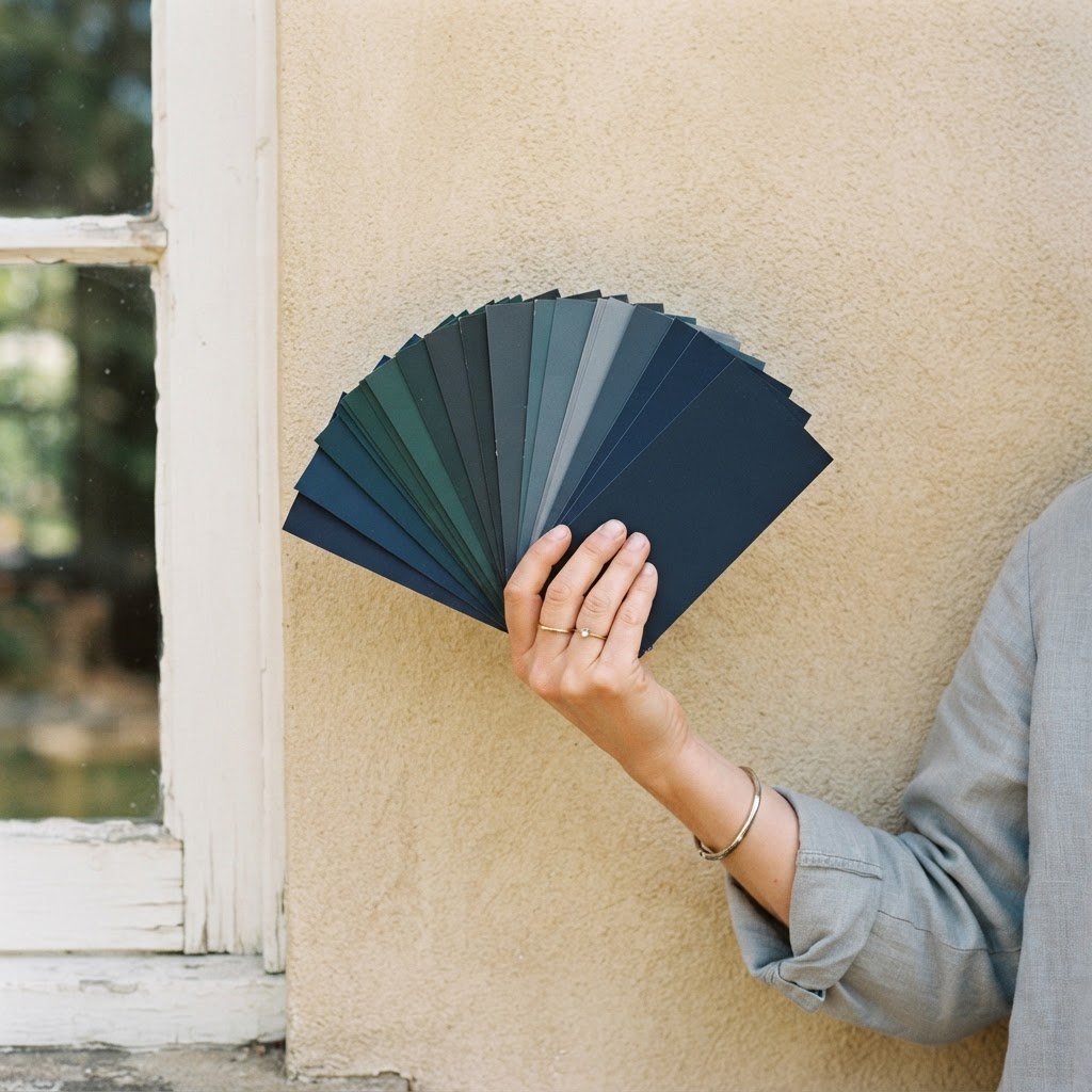
13 Best Shutter Colors for a Beige House
Classic dark shades
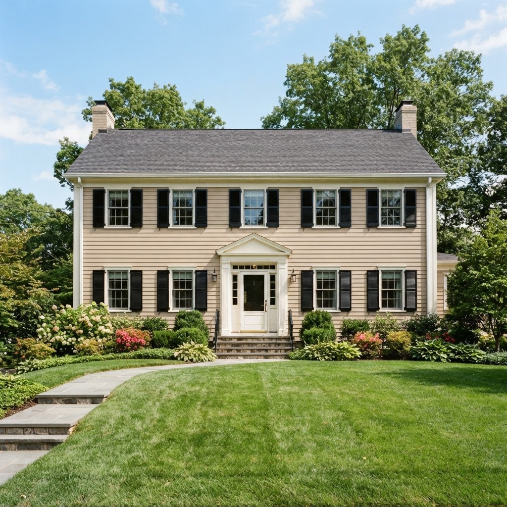
1. Classic black. Black shutters are the safest and smartest choice for most beige houses, and they look especially crisp with warm white trim. Irena recommends Sherwin-Williams Tricorn Black (SW 6258), one of three dark shades she says "help frame the windows against a light beige wall and don't clash with the warm tone of the house." Black shutters also tie in beautifully with black window frames.
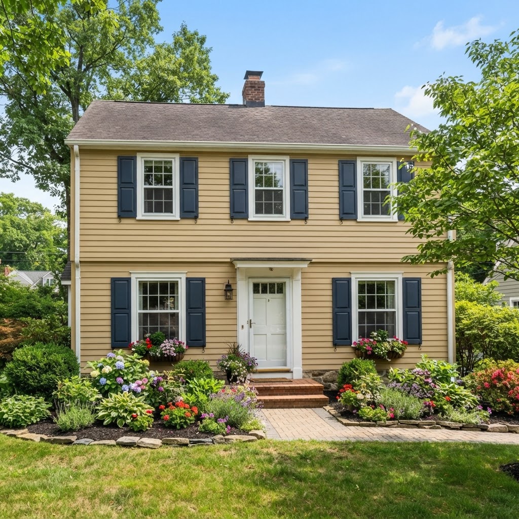
2. Navy. Navy is the classic partner for a warm, yellowish beige. Irena's pick is Benjamin Moore Hale Navy (HC-154), a deep, slightly muted blue that feels traditional without being stiff. The pairing of blue with warm, earthy tones works on the same principle as a blue house with brown trim.
3. Charcoal. Softer than black, charcoal suits a cool, gray beige and looks lovely with gray stone and a slate roof. It's a gentle way to get contrast without harshness, much like the moody graphite colour palette.
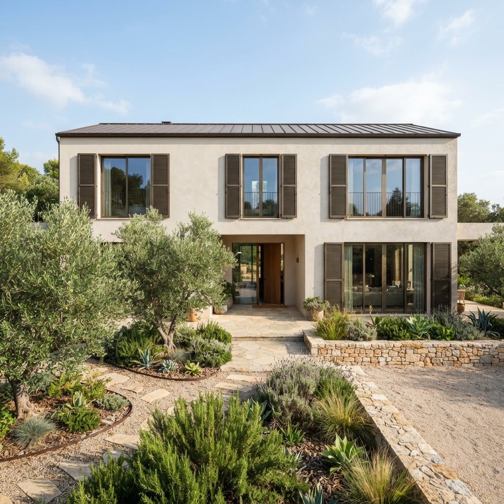
4. Dark bronze. Bronze shutters are a smart choice if your windows have dark metal or bronze frames. Josh's advice for good visual hierarchy is to "match your shutters to your dark sash metalwork and make your front door its own feature."
Greens
5. Deep forest green. Dark greens are timeless on beige, and Irena names them as one of the best choices for both warm, yellowish beiges and pink beiges. A deep forest or hunter green feels at home on a traditional house with a garden, and many of the best green paint colours translate well to shutters.
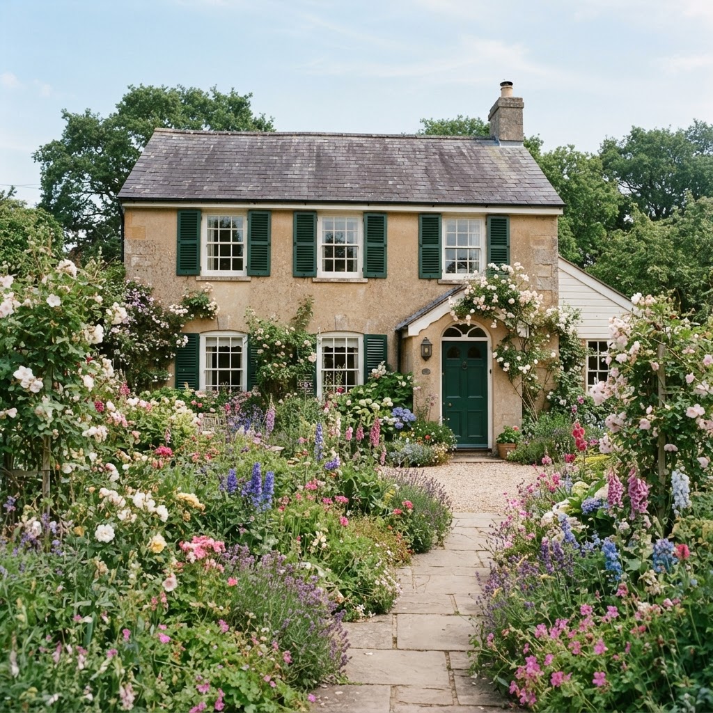
6. Historic olive. For a softer, earthier green, Josh suggests Benjamin Moore Tate Olive (HC-112):
If you're looking for a warm historic olive tone, Benjamin Moore Tate Olive (HC-112) will add interest to any dull tans.
Olive green suits stone, brick and planting beautifully.
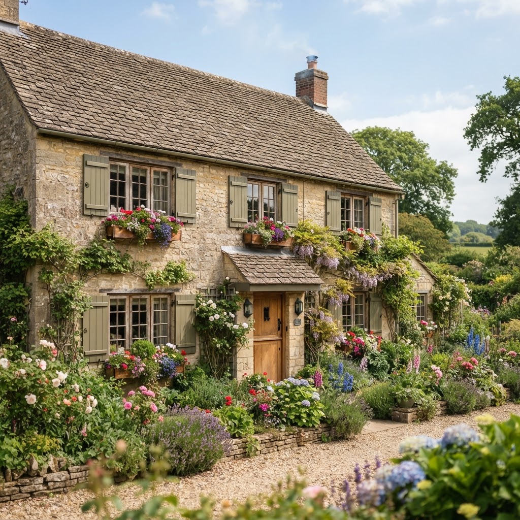
7. Muted green-gray. For a cool, gray beige, Irena recommends Sherwin-Williams Evergreen Fog (SW 9130), a soft green-gray that adds colour without fighting the walls.
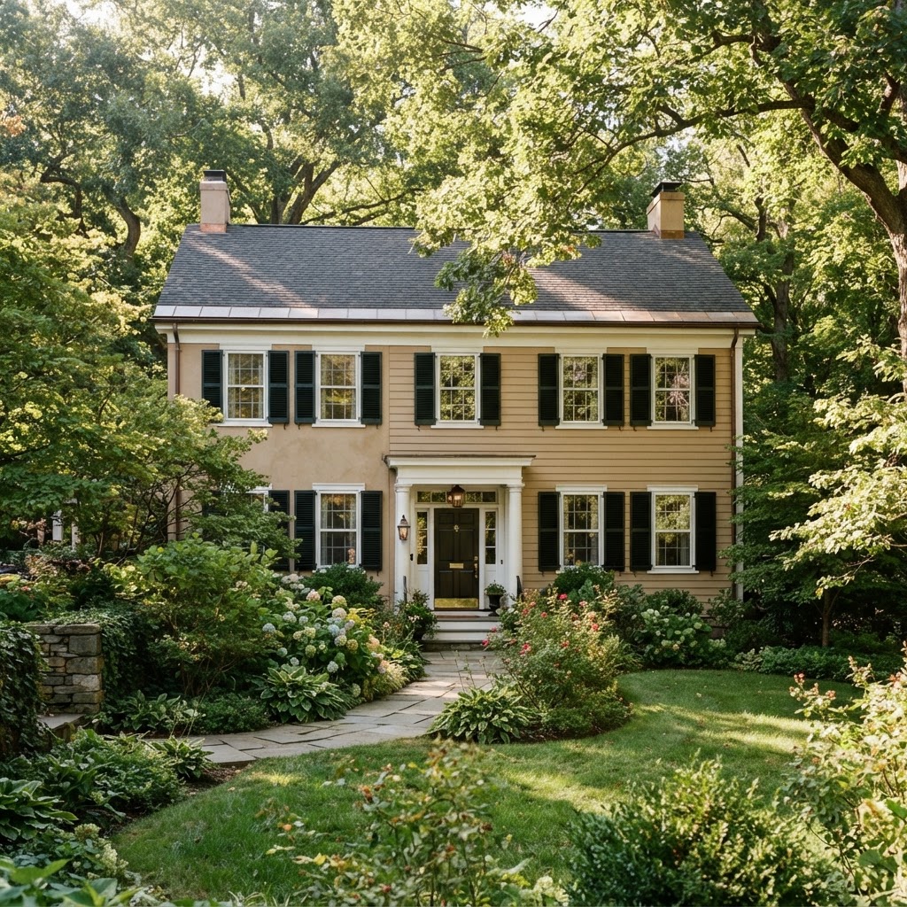
8. Blackened pine. For a dramatic, near-black green, Josh loves Benjamin Moore Salamander (2050-10), "a very dark blackened pine that will add depth to piney tones, as we see on many heritage estates." It's a sophisticated alternative to black.
9. Copper green. Beiges with a green hue have a natural, botanical feel. Josh says these "work well with oxidized copper tones or deep olive blacks to really highlight their natural botanic feel." A soft verdigris green looks especially pretty on a cottage.
Blues, teals and something different
10. Slate blue-gray. A clean slate is one of Josh's two answers for gray-toned greige, and it's a calm, modern choice with white trim and gray stone.
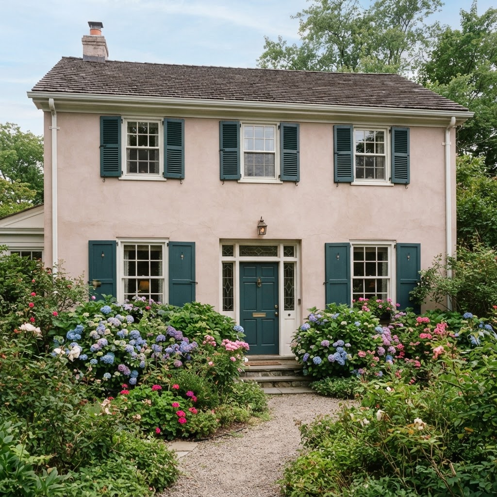
11. Stormy teal. For a beige with a pink or flesh tone, Josh suggests "a black, navy, or stormy teal." Teal sits between blue and green, so it feels fresh and a little more playful than navy.
12. Purple-black. For something unexpected, Josh likes Sherwin-Williams Black Elderberry (SW 9650), which "provides a rich purple-black tone to give your sandy stucco a smart and moody feel." It's a lovely choice on a Mediterranean or Spanish-style house.
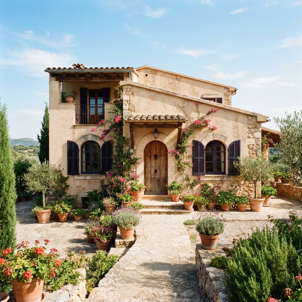
13. Deep espresso brown. Brown can work, but only if it's very dark. A rich espresso brown has enough contrast to frame the windows, whereas a mid-tone brown simply disappears into the walls (more on that below).
Should Shutters Match the Front Door?
This is where our two experts take different approaches, and both work.
Irena likes to connect them:
I like to tie the front door and the shutters together for a cohesive look, or use a darker variation of the same color on the shutters. Warm white is used on the trim. I avoid using three different accent colors.
Josh prefers to keep them separate, so the door stands out:
Matching shutters to your door will cause your front porch to look smaller and the façade to feel monotonous.
His formula is a soft linen tone on the trim, dark shutters and a door in "a custom rich color," which he says gives you "3 depth levels across the elevation."
My view is that it depends on the house. On a small cottage or a simple ranch, matching the door and shutters, as Irena suggests, keeps the front calm and pulled together. On a larger, more formal house with a porch or a grand entrance, a door in its own colour, as Josh suggests, gives the entrance the importance it deserves. Either way, stick to no more than two accent colours. For door ideas, the front door colors for a tan house all work on beige too.
How the Roof, Brick and Stone Change Your Choice
Your walls are only part of the picture. Josh says:
The permanent roofing tiles and masonry should be used as a base for your shutter color palette.
- Brown or tan roof. Irena says that "against brown and tan roofs, navy and greens work well."
- Gray, black or cedar-look roof. Irena notes that "black works well against a dark gray or black roof," and Josh suggests that with "a grey or cedar-look roof, you will want to utilize cool mineral tones in your shutters to keep them balanced."
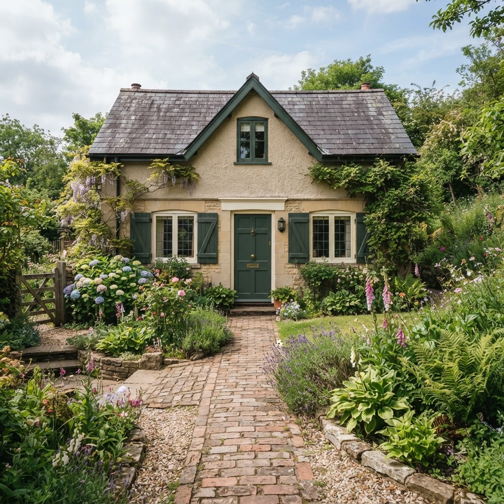
- Warm terracotta roof or red sandstone. Avoid cool shutters here. Josh warns that "using a cool tone on shutters will cause the house to look like two separate parts if you have a warm terracotta roof or red iron sandstone." Warm olives, deep greens and browns are safer, and a warm terracotta roof loves a green shutter.
- Patterned stone or tumbled brick. Josh's tip: "match the deepest colour line in the mortar/brick." This ties the shutters to the house rather than adding a new colour.
Shutter Colors to Avoid on a Beige House
Both experts warn against shutters that are too close to the wall colour. Irena says to "avoid brown shutters close to the wall color as they can often blend in," and Josh adds:
Avoid mid-tone golden browns, primary reds, and full-gloss lacquers because they either wash out the façade or look dated under natural daylight.
Mid-tone shades are the main problem. As Josh puts it, "mid-tone tans lack the luminance value needed to create shadow lines around the casing, leaving the windows looking unarticulated."
Choosing the Right Paint Finish
Irena's advice is clear: "I prefer satin to high-gloss." Josh explains why:
Full-gloss paints exaggerate vinyl woodgrain textures and cast glaring hot spots in afternoon sunlight, whereas an eggshell or low-lustre satin finish preserves saturated, uniform color.
A safety note: if your house was built before 1978, old shutters and window frames may have lead paint. Connecticut's Department of Public Health notes, in its advice for homeowners, that "homes built before 1978 may contain lead-based paint," and that disturbing painted surfaces "can create hazardous lead dust." Test before you sand or strip.
Getting the Size and Style Right
Colour matters, but shutters only look right if they're the right size. The Kennebunk historic preservation design guidelines advise that new shutters "should be true operable shutters and sized correctly for the window," and that "if the shutter is open the slats face upwards." In other words, each shutter should be half the width of the window and the full height, so that the pair would cover the glass if closed.
- Louvered shutters suit Colonial, Georgian and coastal houses.
- Raised panel shutters feel formal and traditional.
- Board and batten shutters suit farmhouses, cottages and rustic homes.
- Hardware such as hinges and shutter dogs in black or bronze adds authenticity.
How I Choose Shutter Colors for a Beige House
After more than 15 years of designing homes, pubs and restaurants, I always follow three simple rules when I'm choosing exterior colours.
- Look at what you can't change first. The roof, brick, stone and even the neighbours' houses are fixed, so I choose shutter colours that work with them rather than against them.
- Go darker than you think. A shutter that looks dark on a paint chip often looks lighter outside in daylight, so I usually go one or two shades deeper.
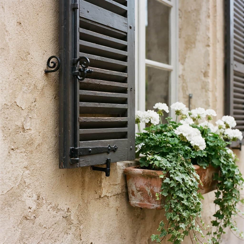
- Think about the planting. Shutters sit behind window boxes, climbers and shrubs, and greens and blacks always look wonderful with flowers in front. A window box of trailing ivy, white geraniums or lavender against dark shutters is one of my favourite ways to finish a beige house.
Before you commit, paint large samples on card and look at them on the house in morning sun, afternoon light and at dusk. If you're also thinking about the whole exterior, the same rules of contrast and undertone apply to green house colors, a white house with black trim and a white house with gray trim.
Shutter Colors for a Beige House at a Glance
| Shutter colour | Paint example | Best with |
|---|---|---|
| Classic black | Sherwin-Williams Tricorn Black (SW 6258) | Most beiges, warm white trim |
| Navy | Benjamin Moore Hale Navy (HC-154) | Warm, yellowish beige |
| Muted green-gray | Sherwin-Williams Evergreen Fog (SW 9130) | Cool, gray beige |
| Historic olive | Benjamin Moore Tate Olive (HC-112) | Dull or flat tans |
| Blackened pine | Benjamin Moore Salamander (2050-10) | Traditional and heritage homes |
| Purple-black | Sherwin-Williams Black Elderberry (SW 9650) | Sandy stucco |
| Stormy teal | A deep blue-green | Pink or flesh-toned beige |
| Slate | A clean blue-gray | Gray-toned greige |
| Dark bronze | A bronze to match the window frames | Dark metal windows |
Common Mistakes to Avoid
| Mistake | Why it's a problem | What to do instead |
|---|---|---|
| Mid-tone brown or tan shutters | They blend into the walls | Choose a dark, contrasting colour |
| Ignoring the undertone | The house can look muddy | Match the shutters to warm or cool beige |
| Cool shutters with a terracotta roof | The house looks split in two | Use warm olives and greens |
| Three different accent colours | The facade looks busy | Limit yourself to two |
| High-gloss paint | Shows texture and glares in sunlight | Use satin or eggshell |
| Shutters that are too small | They look fake | Size each one to half the window width |
Frequently Asked Questions
What color shutters go with a beige house?
Black, navy, deep green, olive, charcoal, slate, stormy teal and dark bronze all work. The best choice depends on whether your beige has a warm yellow, pink, gray or green undertone.
What is the best shutter color for a beige house?
Black is the most versatile, closely followed by navy and deep green. For a warm, yellowish beige, navy or dark green usually looks best; for a cool, gray beige, choose charcoal or a muted green.
Should shutters be lighter or darker than the house?
On a beige house, shutters should almost always be darker. Dark shutters create contrast and frame the windows, whereas light or mid-tone shutters tend to blend into the walls.
Should shutters match the front door?
They can. Some designers match the door and shutters, or use a darker version of the same colour, for a cohesive look. Others prefer a different colour on the door so it stands out. Avoid using more than two accent colours.
What color shutters go with a beige house and a brown roof?
Navy and deep greens work well against brown and tan roofs. Black and charcoal suit gray or black roofs better.
Do black shutters look good on a beige house?
Yes. Black shutters are timeless on beige, especially with warm white trim and black or bronze hardware.
What shutter colors should you avoid on a beige house?
Avoid mid-tone golden browns, tans close to the wall colour, primary reds and high-gloss finishes, which can wash out the facade or look dated.
Frame Your Windows Beautifully
The right shutters turn a plain beige house into a home with character. Read your beige's undertone, choose a colour dark enough to contrast, work with your roof and brick, and finish it in satin or eggshell, and your windows will look framed and intentional from the street.
And if you'd like help choosing colours for your home, inside and out, you can book a one-hour online interior design consultation with me.
About the author
Magda Callery is a UK interior designer and florist with more than 15 years' experience designing homes, pubs, restaurants and bars, and her expert commentary has featured in Homes & Gardens, The Mirror and The Spruce. Explore more of the decorating articles.
Continue reading

Front Door Colors for a Tan House: 13 Expert Picks
The best front door colors for a tan house, with advice from two interior designers and a front door specialist: undertones, 13 colour picks, colours to avoid, finishes, trim and shutters.


Tropical Christmas Decorations: 17 Bright, Festive Ideas
17 tropical Christmas decoration ideas, from palm tree Christmas trees and palm leaf wreaths to poinsettias, orchids and festive tropical tables.

Wildflower Bouquet: 17 Flowers and How to Make One
How to make a wildflower bouquet, 17 of the best flowers to use, the rules on picking wild flowers, wildflower wedding ideas and how to keep stems fresh.