
Choosing the Perfect Color Palette: A Step-by-Step Guide
Ever found yourself lost in the world of colour while designing your dream project? Here's how to build a harmonious palette, from colour theory and psychology to base, accent and neutral shades.
By Magda Callery, interior designer

Ever found yourself lost in the vast world of colors while designing your dream project? You're not alone. Choosing the perfect color palette can feel like navigating a labyrinth, but we're here to make it a walk in the park.
In this guide, we'll break down the process of creating a harmonious color palette into simple, manageable steps. We'll help you understand the science of colors, their psychological impact, and how to use them to breathe life into your designs. No more guesswork, just confident color choices. Let's embark on this colorful journey together.
Understanding Colors and Color Theory
Diving deeper into our colorful journey, we turn towards understanding colors and color theory in greater detail. This knowledge is a vital cog in the wheel of creating impactful designs.
Basic Color Theory: Definitions and Concepts
Color theory, at its core, brims with concepts and definitions that form the groundwork of every design masterpiece. Primary colors, namely red, yellow and blue, constitute the first rung of the color ladder. Blending two primary colors results in secondary colors: orange, green, purple. Further mixing leads to an array of tertiary colors, expanding our palette exponentially.
A color wheel serves as a practical visual tool to comprehend these relationships. It's a circular arrangement of hues, showcasing the symphony of primary, secondary, and tertiary colors.
Another key concept, color harmony, hinges on how colors complement each other aesthetically. Complementary colors, split complementary colors, analogous colors, and triadic color schemes hold an eminent place in this sphere. For example, red and green fall under complementary colors, offering vibrant contrast when used together.
The Psychology of Colors and Their Impact
Moving beyond the physical interpretation of colors, we venture into the realm of psychology. Colors do more than just please the eye: they stir emotions, trigger memories, and influence decisions.
Different colors evoke various psychological responses. For instance, red symbolizes intensity and passion. Consequently, designers often leverage red to grab attention or signal importance. On the opposite side, blue portrays calmness and trust, making it a popular choice for corporate and healthcare sectors.
These reactions aren't set in stone; cultural, personal, and contextual factors can shift perceptions. However, understanding the likely impact of colors aids in predicting responses, giving your design an edge.
Remember, the power of a well-chosen color palette extends beyond mere aesthetics: it's the subtle psychology of color that truly crafts an engaging, memorable design.
Importance of Choosing the Right Color Palette
Building upon our exploration of color theory and color psychology, let's delve into the concrete realm of color palette selection. Recognizing the right color palette's influence on branding, design, and user experience is crucial.
Role of Colors in Branding and Design
Branding and design aren't just about creating captivating graphics. They play a pivotal role in defining a brand's identity. Colors attribute personality to brands. For example, fast-food giants like McDonald's and Burger King use red and yellow, colors that signal excitement and hunger. Meanwhile, luxury brands like Tiffany & Co. leverage a signature robin's-egg blue to convey sophistication and exclusivity. Considerable thought goes into the selection of these colors, reflecting the brand's core values, ethos, and target audience.
Color Palette's Influence on User Experience
In digital design, the color palette dictates a lot more than the aesthetic appeal of a product or a website. It provides functional cues and contributes to navigability. For instance, bright and vibrant colors grab attention and are often used for call-to-action buttons. On the contrary, subdued hues encourage reading and ensure a more relaxed browsing experience. A well-considered color palette increases usability, guiding the user organically from one point to the next.
Step-by-Step Guide to Choose the Perfect Color Palette
After understanding the fundamentals of color theory and their impact in design, we're diving into the practical aspect: selecting the ideal color palette for your project.
Step 1: Identify Your Personality (or Your Brand's)
Our first step is identifying personality. It's crucial because color acts as a silent yet effective communicator of essence. For instance, red typically conveys power and passion, making it a frequent choice for the automotive and technology industries. On the other hand, health and wellness brands often choose green due to its association with nature and serenity. In a home, the same thinking applies: decide how you want a room to feel before you choose a single shade.
Step 2: Use the Color Wheel and Color Harmonies
The color wheel is an essential tool in deciding your color palette as it visually demonstrates the relationship between different hues. Color harmonies explain how various hues interact with each other and how they can create pleasing color schemes. Typical color schemes based on color harmonies are:
- Complementary: uses colors directly opposite each other on the color wheel, like red and green.
- Analogous: uses colors that sit next to each other on the color wheel, like green, yellow-green and yellow.
- Triadic: uses three colors evenly spaced around the color wheel, like red, yellow and blue.
Step 3: Choose Base, Accent and Neutral Colors
Finally, choose the base, accent, and neutral colors. The base color is the most frequently used color, playing the primary role in setting the mood. The accent color makes elements pop and is used in smaller quantities to draw attention. Neutral colors act as a backdrop, balance the other two, and provide visual relief. In interiors, a classic split is roughly 60% base, 30% neutral and 10% accent.
Tools and Resources for Choosing Your Color Palette
Successful navigation through color selection requires not just insights, but also practical tools and resources.
Best Color Palette Generators: A Comparison
Color palette generators help in creating, adjusting, and refining color schemes quickly and efficiently:
- Coolors offers quick and easy color scheme generation with adjustability based on color harmony rules, plus an iOS app for inspiration on the go.
- Adobe Color merges functionality with deeper insights into color theory and integrates with other Adobe design products.
- Color Hunt provides thousands of pre-made color palettes, perfect for quick inspiration.
- Paletton goes beyond color generation by visualising how the colors interact in a layout.
- Colordot presents a simple, user-friendly interface ideal for beginners.
Each generator offers strengths that cater to different needs, from comprehensive suites to simple, straight-to-the-point tools.
Using Color Scheme Design Resources
Aside from palette generators, other design resources come in handy. Pantone Color Guides serve as international standards for colors: physical swatch books that represent color accurately and consistently across different mediums.
Color theory books deliver a deeper understanding of colors and their relationships. Titles such as Color: A Workshop for Artists and Designers by David Hornung and Interaction of Color by Josef Albers offer enlightening perspectives grounded in artistic practice.
Online communities like Dribbble, Behance and Pinterest also prove beneficial by displaying real-world examples of color schemes in use.
Practical Tips for Implementing Your Color Palette
How to Apply Your Color Palette in Different Media
Incorporating your color palette into various media, both digital and print, requires careful consideration. For screens, use Hex or RGB codes to keep colors consistent. For print (brochures, business cards, banners) use the four-color CMYK process and always check a printed proof. For paint and fabric, view physical samples in the actual room, in both daylight and artificial light, before committing.
Dealing with Color Palette Limitations
Every color palette has limitations; acknowledging them helps us get creative within the constraints. When you need more variety, generate shades, tints, or tones of the colors in your existing palette rather than introducing new hues.
Respect accessibility too: ensure high contrast between colors, especially for text, so everything stays readable for people with visual impairments.
Case Studies of Effective Color Palettes
Successful Brand Color Stories
- Coca-Cola: Coca-Cola's signature red exudes energy, passion, and excitement. Its color consistency across print ads, TV commercials and digital media plays a key role in its global brand recognition.
- Starbucks: Starbucks envelops its brand in a soothing shade of green, symbolising growth, renewal, and freshness, and keeps that color consistent across its stores, merchandise, interior design and logo worldwide.
Learning from Color Palette Missteps
- Gap: In 2010, Gap attempted to revamp its classic blue logo with a modern design. Public outrage ensued, and Gap reverted to the original within a week: a stark reminder that color is tightly knit with identity.
- Tropicana: Tropicana's 2009 packaging revamp removed its iconic imagery and alienated customers; sales fell and the brand reverted. The lesson: consider color changes in tandem with other design elements.
Conclusion
Choosing the perfect color palette isn't just about aesthetics. It's a critical component of identity and experience, whether you're designing a brand or a living room. With an understanding of color theory, the color wheel and harmonies, and tools like Coolors and Adobe Color, you're well-equipped to select and use color palettes effectively. Remember, color is more than just a visual element: it's a powerful tool that can evoke emotions, influence perceptions, and ultimately bring a space to life.
If you'd like expert help choosing a colour scheme for your own home, book a one-hour online consultation with Magda.
About the author
Magda Callery is a UK interior designer with more than 15 years' experience designing homes, pubs, restaurants and bars, and her expert commentary has featured in Homes & Gardens, The Mirror and The Spruce. Explore more of the interior design articles.
Continue reading

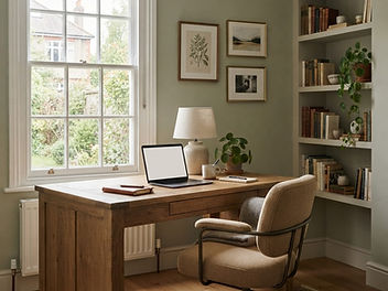
Home Office Design Ideas: A Designer's Guide for UK Homes
Home office design ideas for real British homes, from box rooms and alcoves to cupboard offices and garden rooms, with layout, lighting, colour, storage and video call tips from an interior designer.

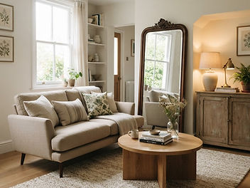
Small Living Room Ideas: How to Make It Feel Bigger
An interior designer's small living room ideas: how to plan the layout, arrange furniture, choose colours and lighting, add storage and decorate so a small room feels bigger and cosier.


Japanese Soaking Tub: A Complete Guide to Ofuro Baths for UK Homes
Deep, compact and made for slow evenings: everything you need to know about Japanese soaking tubs, from sizes and materials to fitting one in a British bathroom and styling the room around it.