
Wimborne White Farrow and Ball: A Designer's Guide
Farrow & Ball Wimborne White No. 239 explained by an interior designer: undertone, how it looks in every light, how it compares with Pointing and All White, and what to pair it with.
By Magda Callery, interior designer

If you're looking for a white that feels soft rather than stark, Farrow & Ball's Wimborne White is one of the first colours designers reach for. It's warm without looking yellow, light without feeling clinical, and it works on walls, ceilings, woodwork and kitchen cabinets alike.
In this guide I'll explain exactly what colour Wimborne White is, how it changes in different light, how it compares with Pointing, All White, School House White and Wevet, which colours go with it, what to do with your woodwork and ceilings, and which finish to choose. Everything comes from Farrow & Ball's own colour information, and from years of using it in real homes.
Wimborne White at a Glance
| Colour number | No. 239 |
| Farrow & Ball's description | A "just off white", named after Wimborne in Dorset, the market town that's home to Farrow & Ball |
| Undertone | Warm, with a soft hint of cream |
| Light reflectance value (LRV) | Around 89, according to independent colour databases. Check the tin, as Farrow & Ball doesn't show it on the colour page |
| Lighter than | Pointing No. 2003 and School House White No. 291 |
| Darker than | All White No. 2005 and Wevet No. 273 |
| Complementary white | All White No. 2005 |
| Recommended primer | Farrow & Ball's White & Light Tones primer |
| Best for | Calm, warm schemes in any room, especially north-facing rooms and period homes |
What Colour Is Wimborne White?
Wimborne White is a soft, warm off-white. On a sample card it looks almost white, but on a whole wall you'll notice a gentle creamy warmth, without the cold blue cast of a brilliant white.
That warmth is what makes it so easy to live with. It softens daylight, flatters wood and natural materials, and makes a room feel welcoming rather than stark. Farrow & Ball describes its complementary white, All White, as just a little brighter, which makes Wimborne White the slightly softer of the two.
How Wimborne White Looks in Different Light
| Room orientation | How it looks | My advice |
|---|---|---|
| North-facing | Soft and calm. The warm undertone stops it looking grey or cold | One of the best whites for north-facing rooms |
| South-facing | Brighter and creamier, especially in strong afternoon sun | Lovely in most south-facing rooms. In very sunny rooms, compare it with a cooler white such as Wevet |
| East-facing | Bright and fresh in the morning, softer later in the day | A good all-day choice |
| West-facing | Cool in the morning, warm and glowing in the evening | Works beautifully if you mainly use the room later in the day |
| Artificial light | Warm bulbs bring out the cream, cooler bulbs make it look whiter | Use warm white bulbs (around 2700K) for a cosy look |
Wimborne White vs Other Farrow & Ball Whites
| Colour | How it compares with Wimborne White | Choose it if |
|---|---|---|
| All White No. 2005 | Lighter and slightly brighter, with no cold undertones | You want a clean, gentle white with less warmth |
| Wevet No. 273 | Lighter and cooler, with a hint of grey | You want a fresh, airy white, especially in a sunny room |
| Pointing No. 2003 | Slightly darker and a little warmer | You want a softer, more traditional cream |
| School House White No. 291 | Darker, a gentle, understated off-white | You want more depth and an old-fashioned feel |
| Strong White No. 2001 | Cooler, with soft grey undertones | You prefer a crisp, contemporary white |
Wimborne White vs Pointing
This is one of the most common questions, and there's a lot of conflicting advice online. Farrow & Ball's own colour information lists Wimborne White as lighter than Pointing. Pointing, named after the colour of the lime pointing in traditional brickwork, is a touch warmer and slightly deeper. If you want a creamier, more traditional white, choose Pointing; if you want something lighter and fresher that still feels warm, choose Wimborne White.
Wimborne White vs All White
All White is Farrow & Ball's recommended complementary white for Wimborne White. It's lighter and a little brighter, and Farrow & Ball describes Wimborne White as just a little softer. Using All White on woodwork and ceilings with Wimborne White on the walls gives a very subtle, layered look.
Where to Use Wimborne White
Living rooms
Wimborne White creates a calm, welcoming backdrop for natural textures such as linen, oak, rattan and wool. It's especially good in north-facing living rooms, where a brilliant white would look flat and grey. My small living room ideas show how a soft white makes a compact room feel bigger.
Kitchens
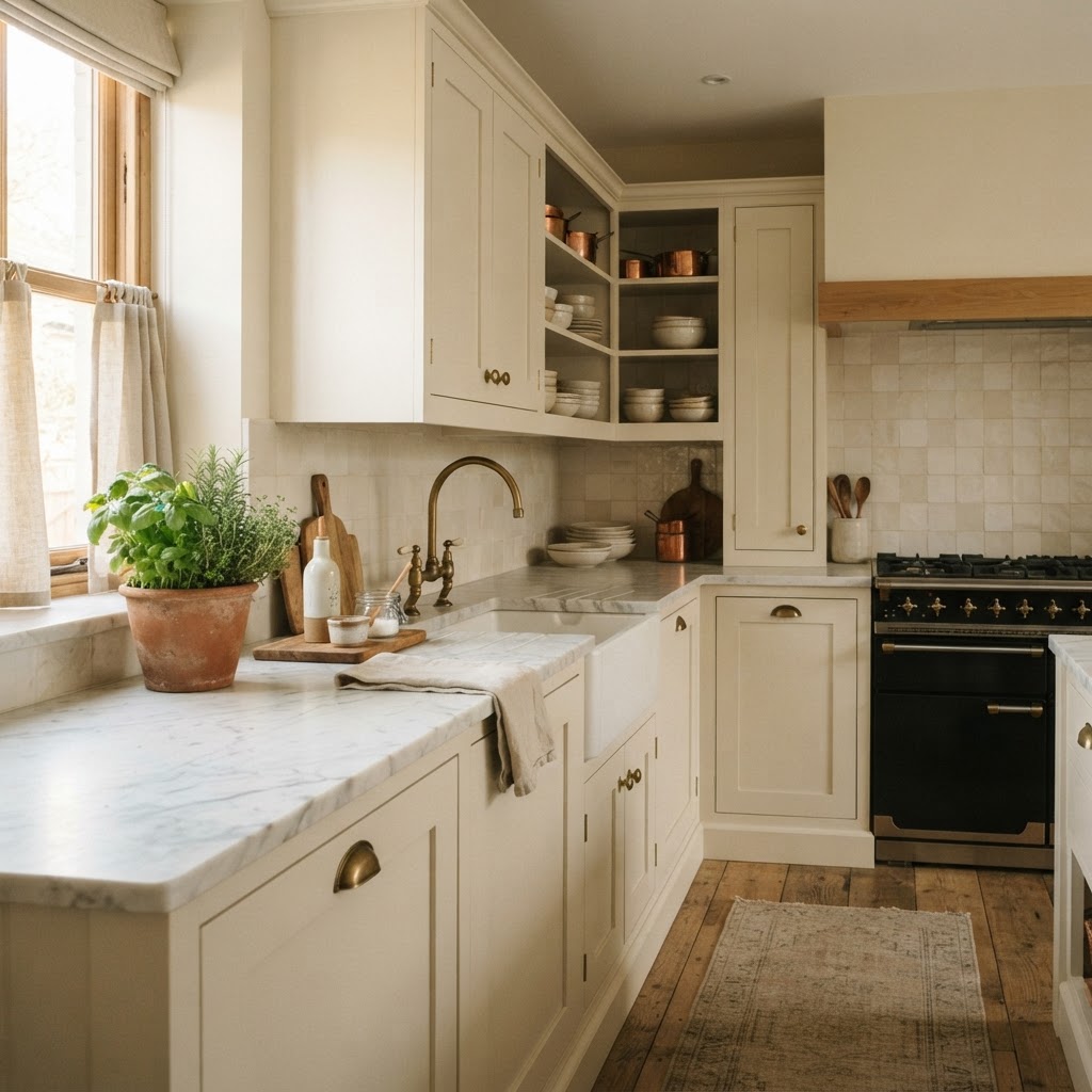
On walls and painted cabinets, Wimborne White looks fresh but never clinical. It pairs beautifully with marble, brass and natural wood. Choose a wipeable finish for kitchen walls, as I explain below.
Bedrooms
Wimborne White gives a bedroom a soft, restful feel, especially with layered bedding in natural linen. My cosy autumn bedroom ideas show how to warm up a pale scheme.
Hallways
In a hallway with little natural light, a warm white bounces light around without looking cold. It's a lovely backdrop for a period hallway too, as I explain in my guide to Georgian hallway ideas.
Ceilings and woodwork
Wimborne White is one of the most popular colours for ceilings and woodwork, because it's soft enough to sit alongside almost any wall colour without looking stark.
Exteriors
Farrow & Ball offers every colour in its exterior finishes too, so Wimborne White can be used on render, masonry, window frames and front doors for a softer look than a bright white.
Colours That Go With Wimborne White
Farrow & Ball suggests these schemes for Wimborne White:
| Scheme | Accent colour | Trim colour | Mood |
|---|---|---|---|
| Warm neutral | Bone No. 15 | Lime White No. 1 | Calm and earthy |
| Soft pink | Pink Ground No. 202 | Setting Plaster No. 231 | Gentle and pretty |
| Fresh blue | Pale Powder No. 204 | Stiffkey Blue No. 281 | Fresh with a bold contrast |
As a designer, I also love Wimborne White with:
- Sage and olive greens, for a natural, calming scheme. See my guide to the best green paint colours.
- Terracotta and earthy reds, for warmth. My terracotta colour guide has plenty of ideas.
- Deep inky blues, for contrast on a front door, kitchen island or bedroom wall. My review of Dulux Ink Well shows how dark blue works with a warm white.
- Natural materials, such as oak, rattan, linen, brass and stone.
If you're planning a whole house, my step-by-step guide to choosing the perfect colour palette shows how to use one white throughout and build colour around it.
What Colour Woodwork and Ceilings With Wimborne White?
There are three main approaches:
- Colour drench. Use Wimborne White on walls, ceiling and woodwork for a seamless, calm and contemporary look. It also makes small rooms feel bigger.
- Subtle contrast. Use Wimborne White on the walls with All White on woodwork and ceilings for a very slightly crisper finish.
- Wimborne White as the trim. Use it on woodwork and ceilings with a stronger wall colour, such as a sage green, terracotta or deep blue.
Which Finish Should You Use?
| Where | Finish | Why |
|---|---|---|
| Living rooms and bedrooms | Estate Emulsion | Farrow & Ball's chalky, very matt finish with the deepest colour |
| Kitchens, bathrooms, hallways and children's rooms | Modern Emulsion | A washable matt finish recommended by Farrow & Ball for kitchens and bathrooms |
| Woodwork, doors and kitchen cabinets | Estate Eggshell or Modern Eggshell | Durable and wipeable |
| Woodwork with a completely flat look | Dead Flat | Fully matt, best where it won't be knocked often |
| Exterior walls | Exterior Masonry | Designed for render and masonry |
Tips for Using Wimborne White
- Sample properly. Paint two coats on a large sheet of lining paper or an A4 card, and move it around the room at different times of day.
- Compare it with your other whites. Hold it against your woodwork, kitchen units and sofa, as whites can look very different side by side.
- Use the right primer. Farrow & Ball recommends its White & Light Tones primer for Wimborne White.
- Apply two coats for an even finish.
- Choose warm bulbs to bring out its softness at night.
Frequently Asked Questions
What colour is Farrow & Ball Wimborne White?
Wimborne White No. 239 is a soft, warm off-white with a gentle creamy undertone. Farrow & Ball describes it as "just off white", and names it after Wimborne in Dorset, where the company is based.
Is Wimborne White warm or cool?
Wimborne White is warm. It has a soft cream undertone, which stops it looking cold or grey, especially in north-facing rooms.
Is Wimborne White yellow?
It isn't yellow, but it has a gentle warmth that can look slightly creamier in strong sunlight or under very warm bulbs.
Is Wimborne White lighter than Pointing?
Yes. Farrow & Ball lists Wimborne White as lighter than Pointing No. 2003, which is slightly warmer and deeper.
Is Wimborne White good for north-facing rooms?
Yes. It's one of the best whites for north-facing rooms, because its warm undertone stops the cool northern light making it look grey.
What white goes with Wimborne White?
Farrow & Ball recommends All White No. 2005 as its complementary white. It's slightly lighter and brighter, making it a subtle choice for woodwork and ceilings.
Can you use Wimborne White on kitchen cabinets?
Yes. Use an eggshell finish for durability. Wimborne White looks lovely on shaker cabinets with marble, brass or natural wood.
The Verdict
Wimborne White is one of the most versatile whites you can choose: soft, warm, easy to live with and beautiful in almost any light. If you want a white that feels welcoming rather than stark, it's an excellent place to start.
If you'd like help choosing the right white for your home, or building a whole-house palette around it, you can book a one-hour online interior design consultation with me. For more ideas, browse my decorating articles.
Pairing Wimborne White with grey? Read my guide to the colour psychology of grey to find a grey that feels warm and welcoming.
Wimborne White is a lovely backdrop for a Parisian look. See my guide to French café interior design for colours, materials and ideas.
About the author
Magda Callery is a UK interior designer with more than 15 years' experience designing homes, pubs, restaurants and bars, and her expert commentary has featured in Homes & Gardens, The Mirror and The Spruce. Explore more of the decorating articles.
Continue reading


How to Remove Musty Smell From Wood Furniture
A step-by-step guide to getting rid of a musty smell in old wood furniture and drawers, with the methods that work, what doesn't, mould safety and how to stop it coming back.

Cost of Replacing a Garage Floor: 2026 Price Guide
What it really costs to replace a garage floor in the UK and US, with prices per square metre and square foot, cheaper alternatives, hidden costs and how long it takes.

Deck Railing Ideas: 30 Stylish, Safe and Cheap Options
30 deck railing ideas, from timber and black metal to cable, glass and cheap DIY options, plus US and UK safety rules, a material comparison and maintenance tips.